
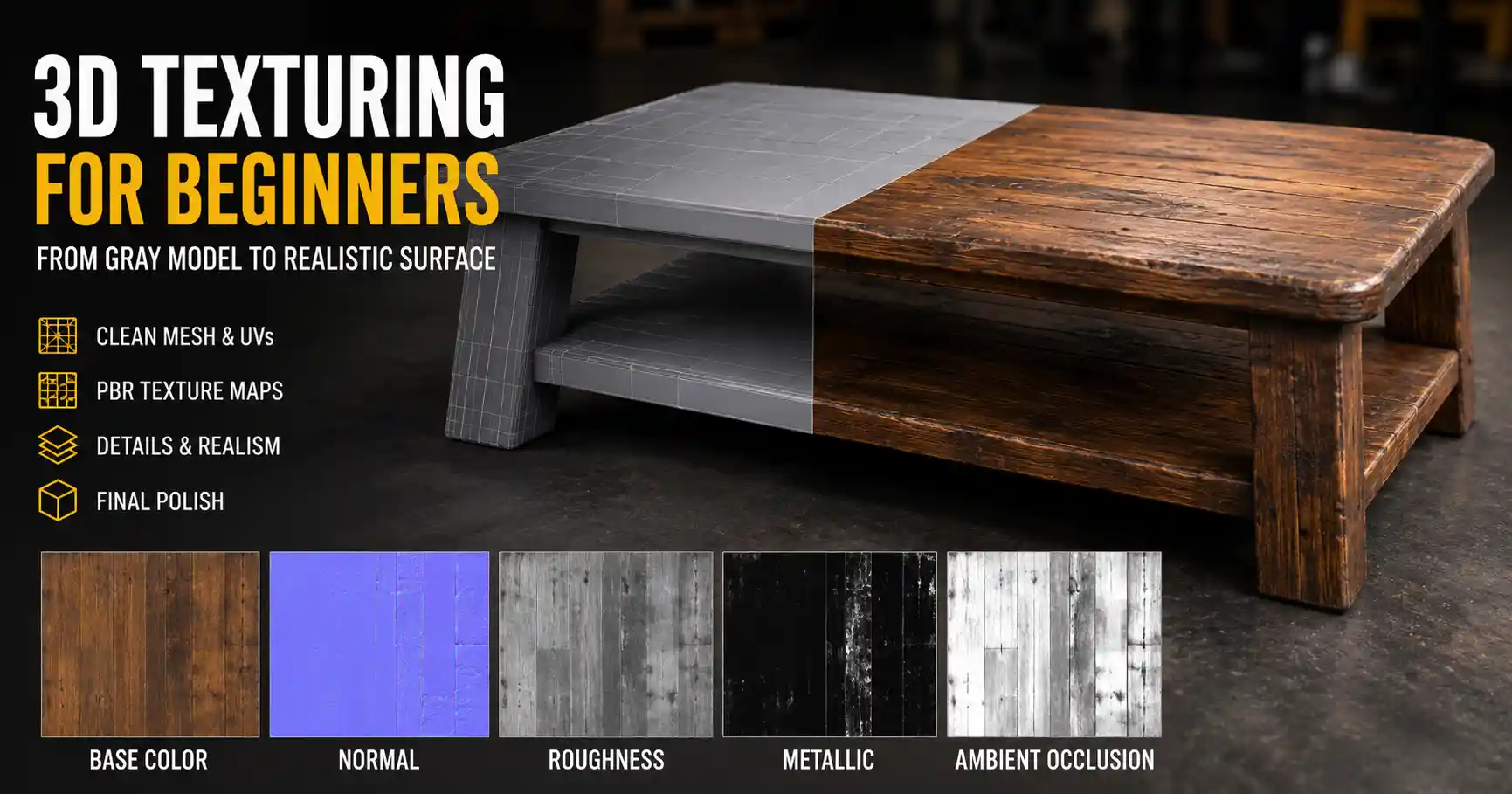
Whether you’re creating a 3D character for a video game, a product render for an e-commerce campaign, or a visual effect for a feature film, a perfectly modeled mesh can fall flat without the right texture. Texturing turns a plain gray shape into something believable: it adds the scuff marks on a work boot, the grain of an oak table, the subtle imperfections that make a 3D object feel tangible and real. For new 3D artists, texturing can feel overwhelming, with a dizzying array of software, techniques, and terminology to master. But once you break the process down into logical steps, it becomes an accessible, even enjoyable creative practice. This guide will walk you through every core stage of texturing 3D models, from planning your texture map set to final polishing, with practical tips that work for beginners and intermediate artists alike.
Pre-Texture Planning and Preparation
Texturing doesn’t start when you open your texturing software—it starts long before, during and right after the 3D modeling process. Skipping this preparation step is one of the most common mistakes new artists make, leading to messy UVs, blurry textures, and hours of rework later. Taking the time to get your model and assets ready will pay off with a smoother texturing workflow and a cleaner final result.
Clean Up Your 3D Mesh
Before you even think about UVs, your 3D model needs to be clean. That means deleting invisible faces, fixing non-manifold geometry, removing overlapping vertices, and checking that your normals are facing the right direction. Non-manifold geometry—edges connected to more than two faces, or faces with zero area—can break UV unwrapping and cause rendering errors later. A messy mesh also makes it harder to apply textures evenly, especially when you’re using sculpting or hand-painting techniques. For game assets, this is also the stage where you’ll optimize your polygon count to match your target platform: a mobile game asset will need far fewer polygons than a cinematic render, which affects how much texture detail you can display clearly.
Unwrap and Organize UVs
UV unwrapping is the process of flattening your 3D mesh into a 2D plane so you can map 2D texture images onto it. Think of it like unwrapping a cardboard box to lay it flat—every part of the 3D surface gets a corresponding spot on the 2D texture sheet. Bad UVs result in stretched, blurry, or distorted textures, so this step is non-negotiable for a professional result.
Core best practices for UV unwrapping include:
- Minimize stretching: Check your software’s UV stretch overlay to spot areas where the texture will be distorted, and adjust your seams to fix it. Most 3D tools like Blender, Maya, and 3ds Max have built-in stretch visualization to make this easy.
- Place seams along natural edges: Hide seams in areas that won’t be visible, like the underside of a table or the back of a character’s head, to avoid obvious texture lines on your final model.
- Match texel density to your use case: Texel density is the amount of texture detail per unit of 3D space. A character that will be seen up close needs a higher texel density (more pixels per centimeter) than a background rock that’s never close to the camera. Consistent texel density across your model ensures no area looks unnecessarily blurry or pixelated.
- Pack UV islands efficiently: If you’re using a single texture sheet, arrange your UV islands to avoid wasting space, which allows you to use more detail for important areas. Leave a small gap between islands to avoid bleeding when you generate mipmaps for game assets.
Gather Reference Materials
Even the most skilled artists don’t work from imagination alone. Reference photos are the foundation of believable textures. Before you start texturing, collect high-resolution photos of the material you’re trying to create: if you’re texturing a leather jacket, find photos of worn leather, scuffs, stitching, and the way leather creases around elbows and shoulders. For a concrete wall, collect photos of cracks, stains, and different lighting conditions to see how the texture behaves.
You can find free reference photos on sites like Unsplash, Pexels, and TexturingXYZ, or even take your own photos with a phone camera if you’re working on a custom asset. Having references on hand keeps your texture consistent and helps you add the small, realistic details that make the final result feel authentic.
Understanding Texture Map Types
Modern texturing relies on multiple texture maps—each a separate 2D image that controls a different property of your 3D model’s surface. Understanding what each map does and how they work together is key to creating realistic textures. While the exact set of maps you need depends on your render engine and use case, these are the most common maps you’ll work with:
Base Color (Albedo) Map
The base color map (sometimes called albedo) defines the base color of your surface. It doesn’t include any lighting or shadow information—just the pure color of the material. For a brick wall, the base color map will have the red of the bricks and the gray of the mortar. For a wooden table, it will have the varying brown tones of the wood grain. When creating a base color map, avoid adding baked-in shadows or highlights, because those will be handled by your scene’s lighting in the final render. Adding pre-baked shadows can make your texture look flat when the lighting changes.
Normal Map
A normal map adds fine surface detail like bumps, scratches, and grooves without adding extra polygons to your 3D mesh. It uses RGB color values to store information about the direction of the surface normals, tricking your render engine into seeing small detail that isn’t actually present in the mesh. This is especially important for game assets, where keeping polygon count low is critical for performance. A 4K normal map can add thousands of dollars of detail to a low-poly mesh that only has a few hundred polygons.
Roughness/Glossiness Map
This map controls how smooth or rough a surface is, which directly affects how light reflects off it. A rough surface like concrete or uncoated paper scatters light, creating a dull, matte finish. A smooth surface like polished metal or glass reflects light sharply, creating bright highlights. Roughness maps use grayscale values: black is fully smooth (shiny), white is fully rough (matte). Glossiness maps are the reverse: white is shiny, black is rough. It’s important to check which convention your render engine uses to avoid getting the opposite result of what you want.
Metallic Map
The metallic map is used in PBR (physically based rendering) workflows to define which areas of your model are metal and which are non-metal. In most PBR setups, metallic maps are also grayscale: white is 100% metallic, black is 0% metallic (dielectric, like plastic or wood). Very few materials are 100% metallic—even a polished steel knife will have small, non-metallic areas where dirt or wear has built up, so adding variation to your metallic map makes the result more realistic.
Height, Ambient Occlusion, and Other Utility Maps
Beyond the core PBR maps, there are several utility maps that add extra realism. A height map adds depth information for displacement, which actually moves the mesh surface to create large-scale bumps and dents (unlike a normal map, which only fakes the detail). An ambient occlusion (AO) map adds soft shadows in crevices and between overlapping surfaces, which makes your model look more grounded and detailed. Other common maps include opacity maps for transparent or cutout details like leaves or chain-link fences, and emissive maps for glowing surfaces like neon signs or LED screens.
Texturing is 80% observation and 20% technique. The best textures don’t just look like a material—they look like a specific, used, lived-in piece of that material.
Common Texturing Workflows
There are three main texturing workflows used by 3D artists today, each with its own strengths and use cases. Most artists use a combination of all three depending on the project, so understanding how each works will give you more flexibility in your work.
Physically Based Rendering (PBR) Texture Painting
PBR is the current industry standard for texturing across games, film, and product visualization. It creates consistent, realistic results that look correct under any lighting conditions, because it follows real-world physical rules for how light interacts with materials. The most common way to create PBR textures today is using a dedicated texturing tool like Substance Painter or Mari, which let you paint directly onto your 3D model with PBR brushes that automatically update all your texture maps as you work.
For example, when you paint a scuff mark on a leather boot in Substance Painter, you can set your brush to not only change the base color, but also increase the roughness where the scuff has worn away the polished finish, and adjust the metallic value if the scuff exposes a metal zipper underneath. This non-destructive workflow lets you experiment and adjust your texture without having to redo entire layers. PBR is ideal for game assets, product renders, and any project where you need your texture to look good under changing lighting conditions.
Photogrammetry and Texture Sourcing
Photogrammetry is the process of creating 3D models and textures from a series of real-world photos. For texturing, this means you can scan a real material (like a wall, a piece of fabric, or a tree bark) and turn it into a high-resolution texture map that’s perfectly accurate. Many professional artists use scanned textures as a base, then tweak them to fit their specific model, rather than creating textures from scratch.
There are huge libraries of free and paid scanned PBR textures available online, from sites like Poly Haven, TexturingXYZ, and Quixel Megascans. Using scanned textures saves time and creates more realistic results than hand-painting for most organic and hard surface materials. If you need a custom texture, you can even create your own scanned textures with just a phone camera and free photogrammetry software like Meshroom. The downside of using pre-made scanned textures is that they can feel generic if you don’t customize them to fit your model—adding custom wear, dirt, or decals to a pre-made texture makes it feel unique.
Procedural Texturing
Procedural texturing uses algorithms and node-based systems to generate textures programmatically, rather than using painted or scanned image files. Tools like Substance Designer, Blender’s Shader Editor, and Houdini let you build textures node by node, adjusting parameters like noise, grain, and color to get exactly the result you want.
The biggest advantage of procedural texturing is that it’s resolution-independent: you can scale a procedural texture to any size without it getting pixelated, and you can adjust parameters in real time to tweak the look. It’s also great for creating patterns like bricks, tiles, or wood grain that are repetitive but need natural variation. Many artists use procedural textures to create custom height and normal maps, or to generate tileable textures that can be repeated across large surfaces like roads or building walls. The learning curve for node-based procedural texturing is steeper than painting or using scanned textures, but it’s an extremely powerful tool once you master it.
Step-by-Step Texturing Process for Beginners
To put all this information into practice, here’s a step-by-step workflow for texturing a simple 3D asset, like a wooden coffee table, that works for most projects. This workflow uses PBR, which is the most flexible and widely used standard today.
- Import your model and UVs into your texturing software
Start by exporting your clean, UV-unwrapped model from your 3D modeling software (Blender, Maya, etc.) as an FBX or OBJ file, then import it into your texturing tool of choice (Substance Painter is the most popular beginner-friendly option). Make sure your UVs import correctly, and check for any stretching or distortion before you start painting. - Add a base material
Most texturing software comes with a library of base PBR materials. Start by adding a base wood material to your entire table. This will give you a starting point for your base color, roughness, normal, and other maps, so you don’t have to build everything from scratch. Adjust the tiling of the wood grain to match the size of your table—you don’t want huge grain on a small side table, or tiny grain on a large dining table. - Add wear and tear based on reference
This is where your reference photos come in. Look at how real wooden tables wear: edges get scuffed from people bumping into them, the area around mugs gets faint rings, the bottom of legs get dirt and scuffs from dragging on the floor. Use a soft, textured brush to add darker dirt to leg bottoms, and erase the top layer of the wood finish on edges to make them look worn. Worn wood is often more rough than finished wood, so make sure to adjust your roughness map to match—scuffed edges should be rougher than the smooth finished table top. - Add ambient occlusion for depth
Bake an ambient occlusion map directly in your texturing software to add soft shadows in the gaps between the table top and the legs, and in any cracks or grooves in the wood. This small step adds a huge amount of depth and realism, making your model look like a solid, three-dimensional object instead of a flat shape. - Add small detail maps
Add a subtle normal map to bring out the wood grain, and adjust the roughness map to add a little variation—real wood isn’t uniformly smooth, so adding small random variations in roughness makes it look more natural. If you have any metal details, like screws or leg caps, make sure those are set to 100% metallic on your metallic map, and adjust their roughness to match how polished they are. - Export your maps and test in your render engine
Once you’re happy with your texture, export all your individual maps (base color, normal, roughness, metallic, AO) in the correct format for your render engine or game engine. Import the maps onto your model, then test how it looks under different lighting conditions. Check that there are no stretched or blurry areas, and that the material behaves correctly—metal should reflect light, rough wood should have dull highlights, and so on. Make any adjustments needed, then export your final textured asset.
Common Texturing Mistakes and How to Fix Them
Even experienced artists make texturing mistakes, but recognizing and fixing them quickly is a skill that comes with practice. These are the most common mistakes new artists make, and simple solutions to fix them:
Over-saturated base colors
One of the most common mistakes new artists make is using over-saturated colors. Real-world materials are almost never extremely bright or saturated—even a bright red brick is more muted than most new artists think. Pull back the saturation of your base color by 10-20%, and add subtle color variation instead of relying on a single saturated hue. For example, a brick wall will have patches of lighter red, darker red, and even gray or brown from dirt and weathering, which makes it look more interesting than a single flat saturated red.
Uniform roughness and metallic values
Real surfaces almost never have uniform roughness. Even a brand new polished table has tiny scratches and dust particles that create small variations in roughness. Adding subtle noise or variation to your roughness and metallic maps breaks up uniformity and makes your texture look more realistic. A 5-10% variation in grayscale values is enough to make a big difference without looking distracting.
Ignoring scale and context
A common mistake is using a texture that’s the wrong scale for your model. A 10cm brick wall with 50cm bricks looks obviously wrong, and it pulls the viewer out of the experience. Always measure your model and check that your texture tiling matches real-world scale. If you’re texturing a character’s shoe, reference how big the stitching on a real shoe is, and adjust your texture to match. Context matters too: a work boot that’s been used on a construction site will have a lot more mud, scuffs, and wear than a dress shoe that’s only been worn to weddings. Your texture should match how the object is used in your scene.
Too much detail
It’s tempting to add every possible scratch, dent, and detail to your texture, but too much detail can make your model look cluttered and unrealistic. Prioritize detail where it matters: high-detail areas are the parts that get the most wear or are closest to the camera. Background objects don’t need the same level of detail as foreground objects, and adding too much detail can hurt performance in games without improving the final result. Remember that less is often more when it comes to texturing.
Conclusion
Texturing 3D models is a skill that combines technical knowledge with creative observation. There’s no shortcut to getting good at it—practice working with different materials, study real-world surfaces, and don’t be afraid to experiment with different workflows. Starting with clean preparation, understanding the purpose of each texture map, and building your process around reference and realistic variation will help you create textures that feel believable and engaging. Whether you choose to paint by hand, use scanned textures, or build procedural materials, the core goal is the same: to bring your 3D model to life by adding the subtle, unique details that make it feel real. As you gain experience, you’ll develop your own workflow that fits your creative style and project needs, and texturing will become one of the most enjoyable parts of the 3D creation process.