
If you’ve ever looked at a 3D render of a wooden table and wondered why the surface looks dull instead of glossy, or why a plastic bottle doesn’t reflect light the way it should in your game asset, the problem almost always traces back to one underrated PBR component: the roughness map. In physically based rendering (PBR), roughness maps are far more than a decorative detail—they control how light interacts with a surface at a micro level, and they’re the secret to making digital materials look realistic. Even many experienced 3D artists underestimate how much a well-crafted roughness map improves a render, relying too heavily on albedo (base color) maps to sell a material. This guide breaks down everything you need to know about roughness maps, from what they are to how to create and tweak them for professional PBR results.
What Is a Roughness Map, and How Does It Fit Into PBR?
To understand roughness maps, you first need a quick refresher on how PBR works. Physically based rendering is a workflow that follows real-world rules of light interaction to create consistent, believable materials across different lighting environments. Instead of relying on artist tweaks to match specific lighting, PBR uses a set of texture maps that define physical surface properties, so materials look natural whether they’re in bright sunlight or a dimly lit room.
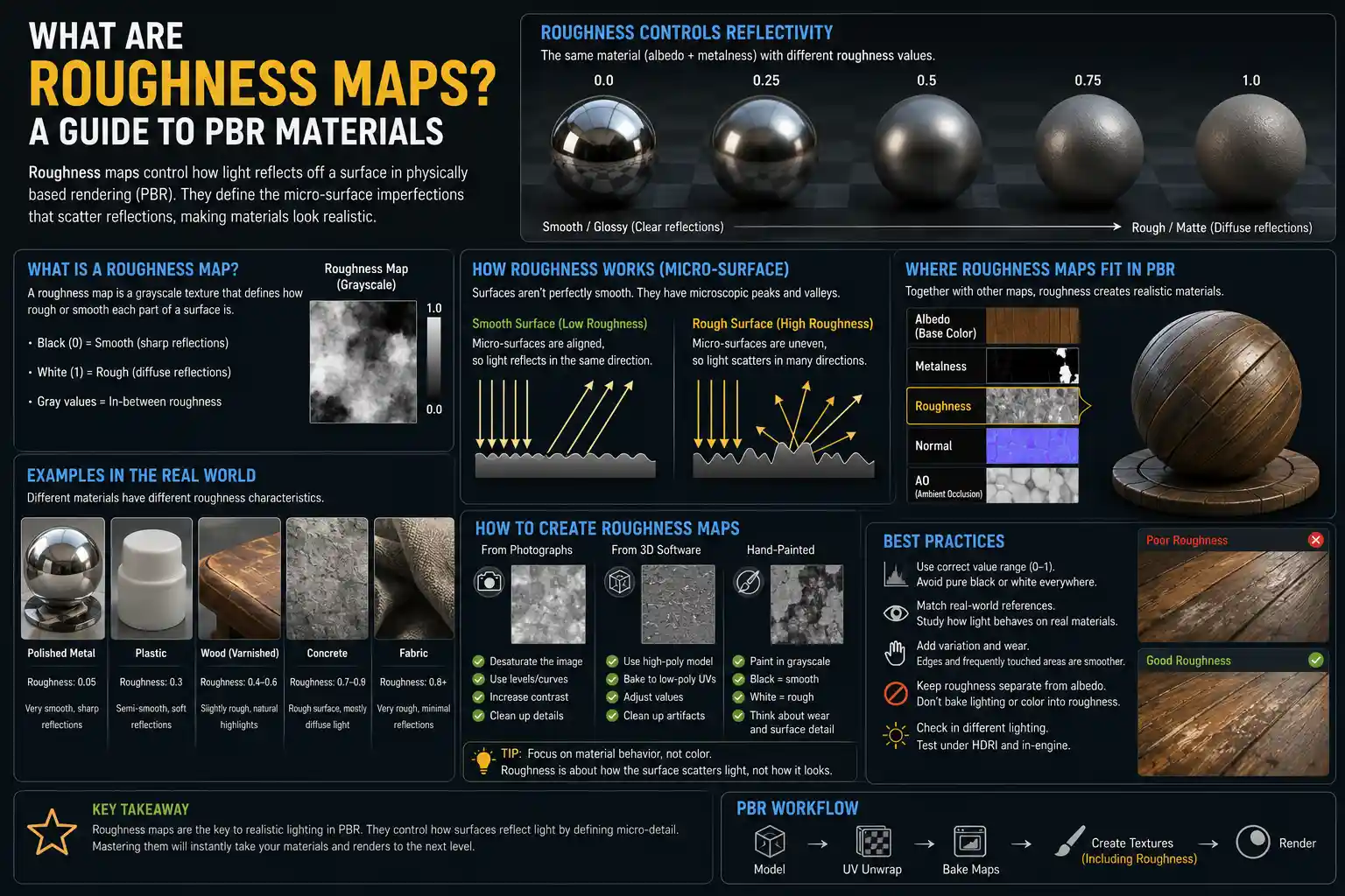
A roughness map is a grayscale texture that defines how rough or smooth a surface is at the pixel level. Unlike many early rendering workflows that used glossiness maps (which invert the value of roughness), roughness maps follow a simple, intuitive grayscale scale: pure black means 0% roughness (a perfectly smooth surface), and pure white means 100% roughness (a completely rough surface). In other words, black = glossy, white = matte.
To see why this matters, think about the difference between a polished steel knife and a piece of uncoated plywood. The steel is smooth: any incoming light reflects in a clear, focused direction, creating sharp reflections of the surrounding environment. The plywood is rough: its micro-scale surface irregularities scatter light in all directions, so reflections are blurry and diffuse. A roughness map encodes exactly that information for every point on your 3D model, letting the PBR shader calculate light reflection correctly.
How Roughness Maps Work With Other PBR Maps
Roughness maps don’t work in isolation. They pair with other core PBR texture maps to define a complete material. The most common companion maps are:
- Albedo (Base Color): Defines the base color of the material, without any lighting or shadow information. The roughness map works independently of albedo, so a dark gray rock can just as easily be glossy as a black plastic bottle.
- Metallic Map: Defines whether a surface is metal or non-metal (dielectric). Metals have different reflective properties than non-metals, and roughness interacts with metallic values to change how reflections look. For example, a rough metal will look dull and brushed, while a smooth metal will be mirror-like.
- Normal Map: Adds micro-scale surface detail (like the grain in wood or bumps on concrete) by altering the surface normal direction. It doesn’t change how light reflects overall—that’s still controlled by roughness.
It’s important to note the difference between roughness and glossiness workflows, since this is a common source of confusion for new artists. Older PBR workflows, and some software like Substance Painter initially, used glossiness maps where white = glossy and black = rough. This is the inverse of the roughness workflow standard used today in most game engines (Unity, Unreal Engine) and renderers (Arnold, Cycles, Octane). If you import a glossiness map into a shader that expects roughness, your glossy surfaces will look matte and vice versa—always check your workflow before exporting textures.
How Roughness Controls Light Reflection: The Science Simplified
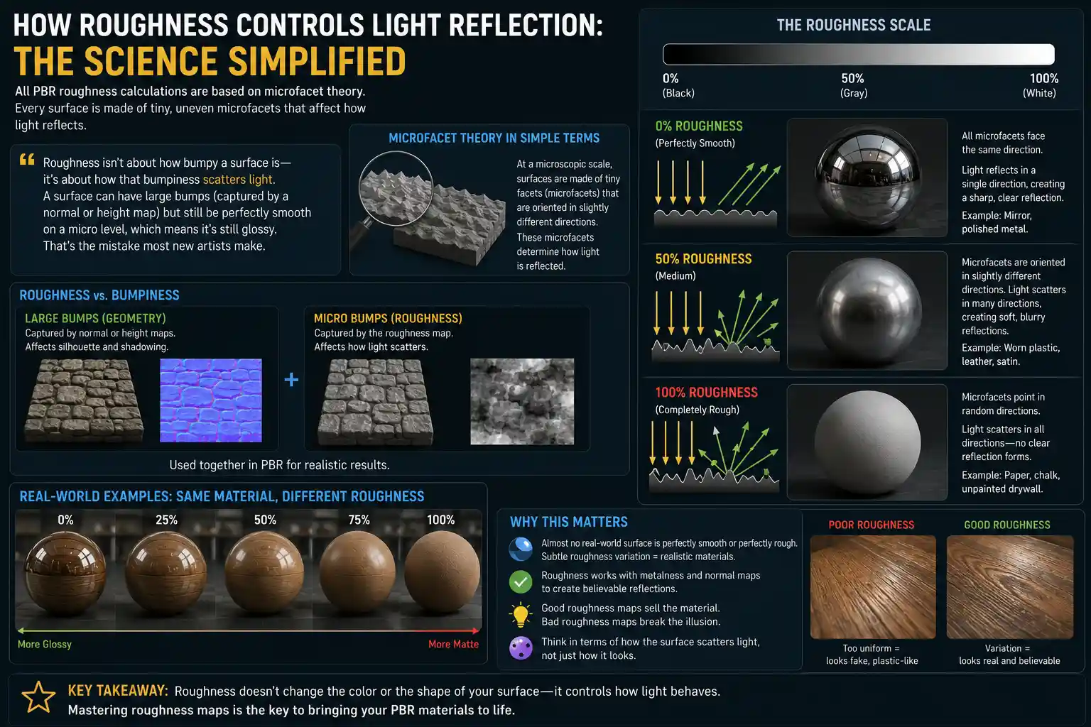
You don’t need a physics degree to use roughness maps effectively, but understanding the basic microfacet theory that PBR is built on will help you make better artistic choices. All PBR roughness calculations are based on microfacet theory, which explains that every surface, no matter how smooth it looks to the naked eye, is made of tiny, uneven microfacets at a microscopic scale.
“Roughness isn’t about how bumpy a surface is—it’s about how that bumpiness scatters light. A surface can have large bumps (captured by a normal or height map) but still be perfectly smooth on a micro level, which means it’s still glossy. That’s the mistake most new artists make.”
To break this down: if a surface is perfectly smooth (0% roughness, black on the roughness map), all the microfacets are facing the same direction. Incoming light bounces off the surface in a single, consistent direction, creating a clear, sharp reflection. That’s why a mirror, which is almost perfectly smooth, shows a crystal-clear reflection. If the surface is completely rough (100% roughness, white on the roughness map), the microfacets are pointed in every random direction. Incoming light bounces off in all different directions, scattering it so much that no clear reflection forms. That’s why a sheet of plain paper has no visible reflections—it’s extremely rough at a micro level.
Between these two extremes, every gray value corresponds to a different level of light scattering. A medium gray value of 50% roughness creates soft, blurry reflections, like the surface of a worn plastic toy or a piece of leather. This matters because almost no real-world surface is perfectly 100% rough or perfectly smooth—most fall somewhere in between, and subtle variations in roughness are what make materials look natural.
Common Misconceptions About Roughness
Even experienced artists sometimes mix up roughness with other surface properties, leading to unrealistic materials. Let’s clear up the most common mistakes:
- Roughness is not the same as bumpiness or height. A common mistake is painting roughness values to match a normal or height map: if you have a brick wall with raised bricks and recessed mortar, you might be tempted to paint the mortar lighter (rougher) because it’s recessed. But in reality, both the bricks and mortar are likely similar roughness. The depth of the mortar is handled by the height or normal map, not roughness. You only change roughness if the actual surface micro-roughness is different between the two areas, like if the mortar is smoother than the bricks.
- Roughness is not the same as metallicity. A metal can be just as rough as a non-metal. Brushed steel is a rough metal, for example, while polished plastic is a smooth non-metal. Metallicity defines whether the surface reflects light like a metal or a dielectric, while roughness defines how scattered that reflection is.
- All roughness values are relative to the scale of your model. A 1cm wide patch of concrete will have much more variation in roughness than a 100m wide terrain of concrete. For large-scale assets, you’ll need to blur or adjust your roughness map to avoid unnaturally sharp reflections that only make sense at close range.
Reading and Interpreting Roughness Maps: Real-World Examples
The best way to get comfortable with roughness maps is to study how they look for common real-world materials. Let’s walk through a few examples to show what good roughness maps do:
Example 1: Ceramic Coffee Mug
A standard glazed ceramic coffee mug is very smooth, so its roughness map is almost pure black across the entire surface. There might be a slightly lighter gray value on the bottom of the mug, where the unglazed ceramic is exposed and rough, and a tiny bit of variation on the handle where repeated hand wear has created a tiny bit of micro-roughness. The result in render: the side of the mug has soft, clear reflections of the room, while the bottom is completely matte. If the roughness map was all white, the mug would look like unglazed clay, not glossy glazed ceramic.
Example 2: Used Wooden Cutting Board
A wooden cutting board that’s been used for years has a lot of variation in roughness. The main surface is worn smooth from years of washing and cutting, so that area is a medium-dark gray (low roughness, fairly glossy). The cuts and scratch marks left by knives are rougher, so those are painted as lighter gray lines. The end grain of the wood, which is more porous, is a lighter gray than the face grain. This variation makes the render look realistic: the smooth areas reflect light softly, while the scratches catch light as tiny rough areas. If the entire cutting board was the same roughness value, it would look flat and artificial, even if the albedo map has the right wood grain color.
Example 3: Car Paint
Car paint is a great example of how subtle roughness variation creates a realistic material. A brand new car has a clear glossy top coat, so the base roughness is very dark (very low roughness). But even new car paint has tiny micro-scratches from washing, which add a tiny bit of light scattering—so the roughness isn’t pure black, it’s a very dark gray. A used car will have more visible scratches and rock chips, which are lighter gray in the roughness map. The rubber trim around the windows is pure white (100% roughness), while the chrome bumpers are pure black (0% roughness). This combination of values makes the car look like a real physical object, not a plastic toy.
One key pattern you’ll notice in all these examples is that realistic roughness maps almost never have uniform values. Even the most uniformly smooth surface has tiny variations from manufacturing, wear, tear, or exposure to the elements. Adding subtle noise or variation to your roughness map, instead of using a solid gray fill, makes the material look far more natural.
Best Practices for Creating and Editing Roughness Maps
Whether you’re generating roughness maps from photogrammetry scans, creating them from scratch in a texturing app, or editing existing maps, following these practical best practices will help you get better results.
Start With Reference Images
Just like with any texturing work, the first step to a good roughness map is looking at real-world references. Take a photo of the material you’re recreating, or look up high-resolution photos online. To judge roughness from a photo, look at how reflections behave: if the reflections are sharp and clear, the roughness is low. If reflections are blurry or non-existent, roughness is high.
For example, if you’re texturing a concrete floor, look at photos of real concrete floors in different lighting. A sealed concrete floor will have clear reflections, so it’s low roughness. An unsealed outdoor concrete floor will have no reflections, so it’s high roughness. Skipping this step is the most common reason roughness maps look wrong.
Add Natural Variation (Avoid Solid Grays)
As we mentioned earlier, almost no real-world surface has perfectly uniform roughness. Even a new, solid plastic desk has tiny variations in roughness from the molding process. Adding subtle, natural variation will make your material look far more believable. A few easy ways to add variation:
- Add a low-strength grayscale noise layer over your base roughness value. Use a soft, blurry noise for large-scale variation, and a fine noise for micro-scale variation.
- Paint lighter roughness values in areas that get more wear: edges, corners, and areas that are touched frequently (like door handles or tool grips).
- Use ambient occlusion or cavity maps to subtly increase roughness in cracks and crevices, where dirt and grime accumulate over time.
It’s important not to overdo this variation—subtlety is key. A variation of 5-10% in grayscale value is enough to make the surface look natural; bigger changes will make it look noisy or uneven.
Match Roughness to the Material’s Age and Condition
Roughness changes with wear and tear. A brand new object is almost always smoother than the same object after years of use. For example:
- A new rubber tire has a slightly rough surface with fine tread grooves, while an old worn tire is smoother in the contact areas where the tread has worn down.
- A new denim jean has a rough woven surface, while an old well-worn jean gets smoother where it stretches against the body.
- A new knife blade is perfectly smooth and glossy, while an old rusted knife blade is rough and matte.
If you’re creating an asset for a game or architectural visualization that tells a story, adjust the roughness map to match that story. A post-apocalyptic scene will have far rougher, more worn materials than a brand new luxury apartment, and your roughness maps should reflect that.
Test Your Roughness Map in Multiple Lighting Environments
One of the biggest advantages of PBR is that materials work in any lighting, but that doesn’t mean you should only test your roughness map in one light. A roughness value that looks perfect in bright directional sunlight might look wrong in a dim indoor environment. Always test your material in at least two different lighting setups:
- A bright environment with strong highlights, to check how the roughness controls the highlight size and sharpness. Lower roughness should create smaller, sharper highlights; higher roughness should create larger, softer highlights.
- A neutral, low-contrast environment, to check that variations in roughness make sense and don’t create unnatural artifacts.
If you’re creating assets for a game engine, export your textures and test them in engine, not just in your texturing software. Different shaders interpret roughness values slightly differently, so what looks right in Substance Painter might need a small adjustment in Unreal Engine or Unity.
Work From Height/Albedo Data When Generating Maps
If you’re generating a roughness map from a photo or a height scan, you can use common software tools like Substance Designer, Photoshop, or CrazyBump to generate a roughness map automatically. A good rule of thumb for automatic generation is that higher areas (protrusions) are often smoother, because they get more wear, while lower areas (recesses) are rougher, because they collect dirt and grime. You can invert your height map to get a base roughness map that follows this rule, then tweak it to match your reference. For example, a brick wall’s height map has raised bricks and recessed mortar— inverting the height map gives you darker (smoother) bricks and lighter (rougher) mortar, which is usually accurate for most brick walls.
Common Roughness Map Mistakes and How to Fix Them
Even with good intentions, it’s easy to make common mistakes that break the realism of your PBR material. Let’s cover the most frequent issues and how to fix them quickly:
Too Much Contrast in Roughness Values
New artists often make roughness maps way too contrasty, turning every small variation into a stark black and white difference. For example, they’ll paint scratches on a car as pure white, when in reality even deep scratches are only slightly rougher than the surrounding clear coat. This makes the material look splotchy and unnatural. Fix: Lower the contrast of your roughness map in Photoshop or your texturing app, and push all values closer to the middle of the grayscale range unless you have a specific reason for a stark contrast.
Confusing Roughness and Glossiness Workflows
As we mentioned earlier, some sources provide glossiness maps instead of roughness maps, and it’s easy to import them into a shader that expects roughness without inverting. The result is that all your glossy surfaces look matte, and all your matte surfaces look unnaturally shiny. Fix: Invert the grayscale values of your texture before exporting. In Photoshop, this is as simple as pressing Ctrl+I (Cmd+I on Mac) to invert the image.
Making Roughness Too Extreme
It’s rare to have pure black or pure white in a roughness map, except for extreme cases like mirrors (pure black) or uncoated paper (pure white). Most materials fall somewhere in between, and many new artists make surfaces too rough or too smooth. For example, most plastics are not perfectly smooth—they have a small amount of micro-roughness, so a pure black roughness map will make them look unnaturally glossy like glass. Fix: Shift your roughness values away from the extremes: if you have a glossy surface, use a very dark gray instead of pure black, and if you have a matte surface, use a very light gray instead of pure white. The only exception is when you specifically want a perfectly mirror-like surface or a completely diffuse surface.
Copying Roughness From Albedo
Many new artists automatically generate a roughness map by desaturating the albedo map, assuming that darker areas of the albedo are smoother and lighter areas are rougher. This is almost never correct. For example, a black plastic bottle is dark in albedo, but it’s just as smooth as a white plastic bottle. A white piece of chalk is light in albedo and rough, but a white piece of glossy ceramic is light in albedo and smooth. Fix: Never desaturate your albedo map to get a roughness map. Always create roughness as a separate map, based on the physical properties of the material, not the color.
Conclusion
Roughness maps are the unsung workhorses of PBR texturing. While base color and normal maps get most of the attention from new artists, it’s the roughness map that actually controls how light interacts with your material, and it makes the biggest difference in whether a render looks realistic or artificial. The good news is that once you understand the basic rules—grayscale values, how roughness interacts with other PBR maps, and the importance of subtle variation based on real-world reference—creating good roughness maps becomes second nature.
The key takeaway is to treat roughness as a physical property, not just a grayscale texture to fill in. Always reference real materials, add subtle variation that matches the age and wear of your asset, and test your work in different lighting to make sure it looks right. Whether you’re creating game assets, architectural visualizations, or 3D art for print, a well-crafted roughness map will elevate your work from good to professional, making your materials look believable in any environment.