
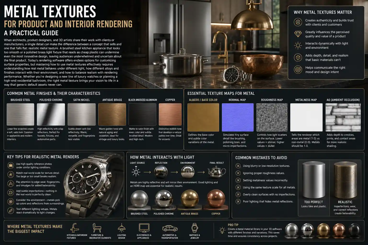
When architects, product designers, and 3D artists share their work with clients or manufacturers, a single detail can make the difference between a concept that sells and one that falls flat: realistic metal texture. A brushed steel kitchen appliance that looks too smooth or a polished brass light fixture that reads as cheap plastic can undermine even the most innovative design, leaving audiences underwhelmed and uncertain about the final product. Today’s rendering software offers endless options for customizing surface properties, but mastering how to use metal textures effectively requires understanding how real metal behaves under different light, how different alloys and finishes interact with their environment, and how to balance realism with rendering performance. Whether you’re designing a new line of luxury watches or planning a high-end residential bathroom, the right metal texture brings your vision to life in a way that generic default assets never can.
The Fundamentals of Metal Textures for Rendering
Unlike diffuse materials such as fabric or wood, metal is a specular dominant material, meaning its visual character comes almost entirely from how it reflects light rather than how it absorbs and scatters it. This core physical property changes everything about how you approach creating and applying metal textures in your 3D projects. For non-metallic materials, the base color map defines most of the surface’s appearance; for metal, the base color only contributes subtle hue and shadow variation, while reflection, roughness, and normal maps do the heavy lifting.
To understand why this matters, consider two common finishes: polished silver and brushed aluminum. Polished silver is nearly 100% reflective, so its appearance is mostly a mirror of the surrounding environment. Brushed aluminum has fine linear grooves that break up reflections, creating soft directional highlights instead of sharp mirror images. Without a texture that encodes that groove pattern into the roughness and normal channels, even a perfect silver base color will look wrong. This fundamental difference means that beginner 3D artists often struggle with metal textures, because they apply the same workflow they use for plastic or paint, resulting in flat, unrealistic results.
Common Metal Types Used in Product and Interior Design
Every metal alloy has unique visual properties that translate to specific texture requirements. The most common metals used in commercial design include:
- Stainless Steel: A staple for kitchen appliances, medical equipment, and modern architectural details. It ranges from mirror-polished to heavy brushed finishes, with a subtle silver-gray hue that rarely has warm undertones.
- Aluminum: Lightweight and widely used in consumer electronics, window frames, and automotive parts. It has a brighter, cooler silver tone than steel and often features anodized colored finishes that add a subtle metallic sheen to solid hues.
- Brass: A warm gold-toned alloy popular for decorative hardware, light fixtures, and mid-century modern interiors. Unlacquered brass oxidizes over time, creating rich patina that adds depth and character for design projects aiming for a vintage or lived-in look.
- Copper: A reddish-brown metal used for roofing, cookware, and accent details. Like brass, it develops a distinctive greenish-blue patina as it ages, a texture feature that can add immense visual interest to rustic or industrial designs.
- Gold: Used for luxury jewelry, high-end watch cases, and decorative accents. It has a warm, high-reflectivity yellow hue that requires careful adjustment of roughness to avoid looking garish or plastic-like in renderings.
- Blackened Steel: A treated steel with a dark, almost matte finish common in industrial and minimalist interior design. It has very low reflectivity and a subtle blue-gray undertone that reads as moody and sophisticated.
When selecting a texture for your project, it’s important to match the alloy to the real-world use case. A bathroom faucet labeled as “brass” is rarely solid raw brass these days; most are brass-plated with a clear lacquer coating, so the texture should reflect a consistent warm gold tone without heavy patina, unless the design specifically calls for an unlacquered finish. Small details like this build trust with clients, who will recognize that you’ve accounted for how the product will actually look and age in real life.
Key Texture Maps for Realistic Metal Rendering
Modern PBR (physically based rendering) workflows rely on multiple interconnected texture maps to replicate real surface behavior. For metal, some maps are far more critical than others, and understanding how each contributes to the final result will help you adjust textures to get the look you want.
Base Color (Albedo) Map
For PBR metal/roughness workflows, the base color map for metal only stores the inherent color of the alloy, not the highlights or reflections. Most pure metals have relatively dark base colors: a polished stainless steel base color is actually a medium gray, not bright white, because most light is reflected rather than diffused. One common mistake is making the base color too bright, which makes the metal look washed out and non-metallic. For patinated or weathered metal, the base color will store variation from oxidation, scratches, and discoloration, adding visual depth that makes the texture feel authentic.
Roughness Map
The roughness map is the most important map for defining metal finish after reflectivity. Roughness controls how sharp or blurred reflections are: a value of 0 is perfectly smooth (mirror-like), while a value of 1 is completely diffuse (no reflection). For brushed metal, for example, the roughness map will have fine linear variations where the grooves of the brush are slightly rougher than the high points of the surface. This creates that distinctive directional highlight that all brushed metals have. For scratched metal, the roughness map will encode the scratches as slightly rougher lines that catch light differently than the surrounding surface.
Normal Map
Normal maps add micro-surface detail without adding geometry to your model. For metal textures with deep brush marks, hammered indentations, or cast texture, the normal map will create the illusion of depth that catches light and shadow, making the texture feel tangible. For example, a hammered copper backsplash will have small, irregular indentations that create tiny highlights and shadows across the surface. Without a normal map, that detail would be missing, and the copper would look flat, even if the color is correct. For very subtle finishes like polished steel, a very subtle normal map can add just enough micro-surface variation to keep the metal from looking like a perfect plastic mirror.
Height and Displacement Maps
For projects that require extremely close-up details, such as product renders of jewelry or cutlery, height or displacement maps add actual geometric depth to the surface. While normal maps fake depth by modifying how light interacts with the surface, displacement maps actually adjust the geometry of your model, creating realistic shadows and indentations that read correctly even at high resolutions. This is especially useful for textures like cast iron, which has a naturally uneven, pitted surface, or hand-hammered metal hardware, where the irregularities of the handwork are part of the design appeal.
"The difference between a good metal render and a great one is almost always in the micro-details. A perfect mirror-polished metal doesn’t exist in real life. Even the most carefully polished watch case has tiny micro-scratches and surface variations that break up reflections just enough to look real. Generic metal textures skip those details, and that’s why they look fake."
Practical Tips for Applying Metal Textures in Common Projects
Different types of render projects require different approaches to metal textures. A product render of a smartphone needs a far different level of detail than an interior render of a commercial lobby, where the metal is just one part of a larger scene. Below, we break down best practices for the most common use cases.
Product Rendering for Consumer Goods
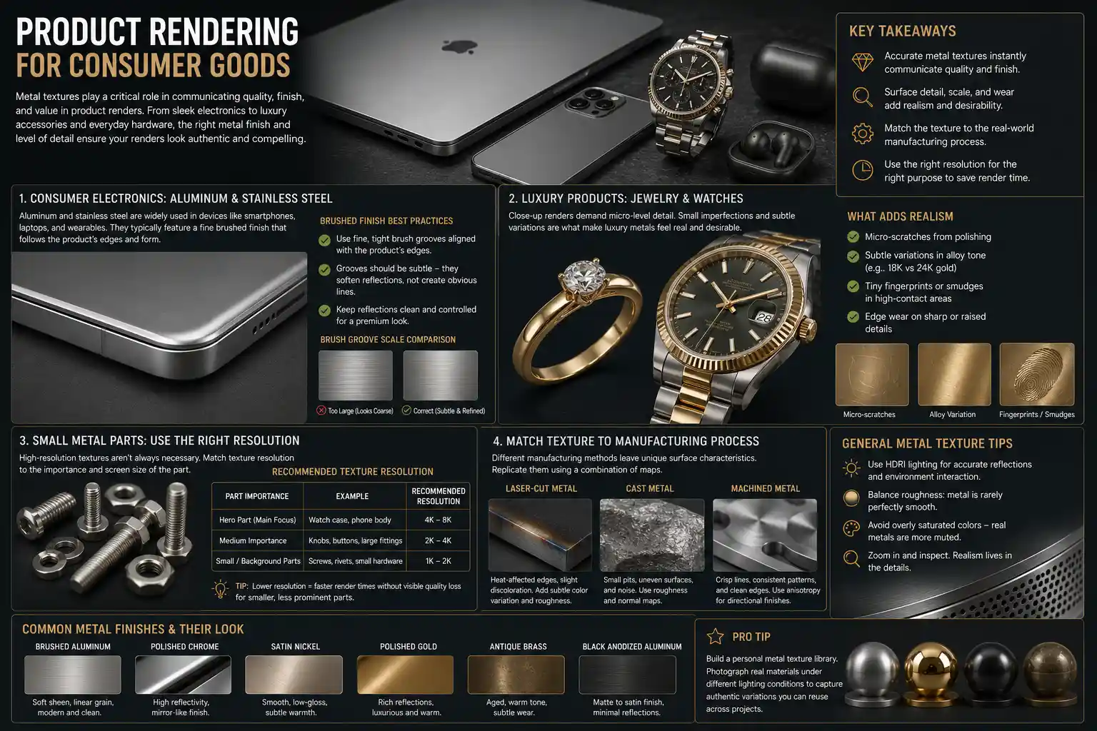
Product rendering relies on metal textures to communicate quality and finish to consumers, manufacturers, and investors. For consumer electronics like smartphones or laptops, aluminum and stainless steel are the most common metals, and they almost always have a fine brushed finish aligned with the device’s edges. A common mistake here is making the brush grooves too large, which makes the finish look coarse and cheap. The grooves should be subtle enough that they only soften reflections slightly, not create obvious lines across the surface. For luxury products like jewelry or watches, close-up details matter: micro-scratches from polishing, subtle variations in gold alloy tone, and even tiny fingerprints or smudges can add realism that makes the product feel desirable.
For small metal parts like hardware or screws, avoid using high-resolution 8K textures unless the part is the focus of the render. Most small parts in a larger product shot only need a 1K or 2K texture, which saves on rendering time without sacrificing quality. Always match the texture to the manufacturing process: laser-cut metal will have slightly discolored edges from heat, while cast metal will have small surface imperfections that can be added via a subtle roughness or normal map.
Interior Design Rendering for Architecture
In interior rendering, metal textures act as both functional and decorative elements, from structural steel beams to kitchen cabinet hardware. One of the biggest challenges here is scaling the texture correctly: a brushed steel refrigerator panel that has 1cm-wide brush grooves will look wrong if the same texture is applied to a 3m-tall structural steel column, where the grooves need to be proportionally larger. Always check the real-world scale of your texture before applying it: most PBR texture packages include texture size metadata, but it’s worth adjusting to match your scene’s scale.
For different interior styles, certain metal textures are more appropriate than others:
- Minimalist/Modern: Stick to smooth brushed stainless steel, matte blackened steel, and polished chrome. Avoid heavy patina or texture variation, which will clash with the clean aesthetic.
- Industrial: Embrace weathered steel, raw cast iron, and oxidized copper. Add subtle wear and tear, like scratches and chipped paint around edges, to reinforce the raw, functional vibe.
- Mid-Century Modern: Warm unlacquered brass and aged bronze are go-to options for hardware and light fixtures. A subtle patina adds warmth that complements wood tones and organic materials.
- Luxury Traditional: Polished gold, polished nickel, and antique silver are common. Add subtle surface variation to avoid the flat, fake look of generic polished metal textures.
Another key tip for interior rendering is to adjust the metal’s reflectivity based on its position in the scene. A large mirror-polished stainless steel countertop will reflect the surrounding room dramatically, which can look distracting if the reflection includes messy HDRI environment details. In these cases, slightly increasing the roughness to soften reflections can create a more natural look that doesn’t pull focus from the overall design.
Sourcing and Customizing Metal Textures
There are dozens of places to source pre-made PBR metal textures, but knowing how to customize them to fit your project is what separates generic renders from professional work. Whether you download free textures or purchase high-end packs, you’ll almost always need to make adjustments to match your specific design vision.
Where to Source Quality Metal Textures
For beginner and intermediate artists, there are many high-quality free options that work well for most projects:
- Poly Haven: Free, CC0 licensed 1K and 2K PBR metal textures, with options ranging from brushed steel to patinated copper. All textures are correctly calibrated for PBR workflows, so you can drop them into most render engines without major adjustments.
- Texture Haven: Another free CC0 resource with a large library of scanned metal textures, including weathered and industrial options. Many textures come in 4K resolution for free.
- Ambient CG: A long-running free resource with scanned PBR textures, including a wide selection of architectural and product-focused metal finishes.
For professional artists working on commercial projects, paid texture libraries offer higher resolution and more variation. Sites like Textures.com, PBRTextures.com, and Quixel Megascans offer thousands of scanned metal textures up to 8K resolution, with accurately calibrated maps that require minimal adjustment. Quixel, which is included for free with most Epic Games licenses, has an especially large library of weathered and natural metal textures, which is perfect for architectural and industrial projects.
Customizing Textures for Your Project
Even the best pre-made texture will rarely fit your project perfectly out of the box. Simple adjustments can make a generic texture feel custom and authentic. One of the most common adjustments is matching the direction of brushed metal to your model: most pre-made brushed textures have horizontal grooves, but if your product has vertical brushing, you can simply rotate the texture’s UVs to match. For a more natural look, add a subtle layer of noise to the roughness map to break up uniform texture; real metal never has perfectly consistent roughness across the entire surface.
If you need a completely custom texture, such as a specific patina for a bespoke architectural detail, you can scan your own texture using a smartphone and a flatbed scanner. For small metal samples, a flatbed scanner can capture high-resolution color and detail that you can then process into PBR maps using free software like GIMP or Blender, or paid tools like Substance Designer. This is a great option for custom furniture or hardware designers who want to replicate an actual physical sample in their renderings.
Another common customization is adding wear and tear to make the metal feel lived-in. For example, a kitchen faucet that gets daily use will have subtle scratches around the handle where hands grip it, and slight discoloration around the base where water sits. Adding these small details via a masked layer on the roughness and base color maps makes the rendering feel more realistic and relatable, especially for interior design projects that aim to showcase a lived-in home rather than a sterile showhome.
Optimizing Texture Size and Performance
High-resolution 8K textures look incredible, but they can drastically slow down your viewport and increase rendering time. For most projects, 2K or 4K textures are more than enough, even for large surfaces. Only use 8K textures for close-up product shots where the metal surface is the main focus. If you’re working with a large scene with multiple metal elements, you can use mipmapping to reduce resolution for distant objects, which improves performance without any visible quality loss.
Common Mistakes to Avoid With Metal Textures
Even experienced 3D artists make common mistakes when working with metal textures that undermine the realism of their renderings. Recognizing and avoiding these mistakes will save you time and help you create more convincing results.
The most common mistake is over-saturating the base color. Pure metals like gold and copper do have distinctive colors, but they are far less saturated than most beginner artists think. A highly saturated gold base color will look like cheap plastic, not real gold. To fix this, simply desaturate the base color slightly and let the reflectivity and lighting do the work of communicating the metal’s color.
Another widespread mistake is incorrect reflectivity values. In PBR workflows, most metals have a reflectivity value between 0.8 and 0.98, while non-metals are between 0.0 and 0.1. Setting the reflectivity too low will make the metal look dull and non-metallic, while setting it too high will make it look unnaturally mirror-like. The only exception is very matte metals like blackened steel or cast iron, which can have lower reflectivity values because of their rough, porous surface.
Ignoring scale is another common issue, especially in interior rendering. As we mentioned earlier, a texture that looks correct on a small doorknob will look wrong when scaled up to a 2m-tall steel door. The texture’s features (brush grooves, hammer marks, pits) will be disproportionately large, making the surface look coarse and unrealistic. Always measure the real-world size of your texture’s features and adjust the UV scale to match. A good rule of thumb: if you can clearly see individual texture features from across the room, they’re too large.
Finally, many artists forget to account for clear coats and coatings. Most modern metal products, from cars to appliances to hardware, have a clear lacquer or powder coating over the raw metal. This clear coat adds an extra layer of reflectivity that creates a sharp top-level highlight over the base metal texture. Adding a clear coat node to your material shader will replicate this effect, making the finish look more authentic. Uncoated raw metals don’t need this layer, but almost all mass-produced metal products do.
Conclusion
Metal textures are a small but critical detail in product and interior rendering, with an outsize impact on how audiences perceive your design. A realistic, well-calibrated metal texture communicates quality, attention to detail, and respect for the materials that make up your final product or space. By understanding the fundamental physical properties of metal, learning how to use PBR texture maps effectively, matching your texture choice to your design style, and avoiding common mistakes, you can create renderings that feel tangible, authentic, and true to your original vision. Whether you’re a beginner just learning PBR workflows or a seasoned professional looking to refine your results, focusing on the small details of metal texture will elevate your work and help you communicate your design ideas more effectively to clients, stakeholders, and audiences. With the wide range of high-quality free and paid resources available today, there’s never been a better time to master this essential skill.