
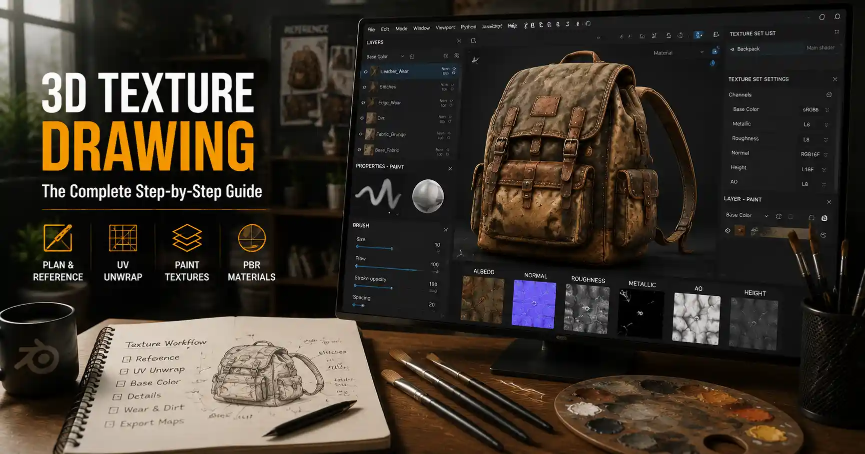
Whether you’re creating a character for a video game, a product mockup for an e-commerce site, or a photorealistic environment for a short film, great texturing makes the difference between a flat 3D model and one that feels tangible. Textures add depth, wear, material authenticity, and personality to even the most perfectly modeled geometry. But for new 3D artists, texture drawing can feel overwhelming: between software choices, PBR workflows, and endless brush options, it’s hard to know where to start. This guide breaks down the entire process, from planning your textures to adding the final details that make your work feel alive.
Preparing for Texture Drawing: Planning and Base Setup
Before you ever pick a digital brush or drop a layer of color, good texture drawing starts with preparation. Skipping this step often leads to inconsistent results, messy files, and hours of rework later. Taking the time to plan your textures and set up your workspace correctly will make the entire drawing process smoother and more predictable.
Reference Gathering and Material Analysis
The most convincing textures are based on real-world observation. Even if you’re creating a fantasy material like dragon scales or alien rock, grounding your work in real physical properties will make it feel believable. Start by collecting 5 to 10 high-quality reference photos of the material you want to draw. For example, if you’re texturing a worn leather boot, look for close-ups of scuffs, creases around the ankle, discoloration from sweat, and fraying at the stitching. Don’t just look at perfect stock photos: search for candid photos of real used items to capture the irregularities that make textures feel real.
As you review your references, ask yourself three key questions to break down the material’s properties:
- How does light interact with this material? Is it rough and matte, smooth and glossy, or somewhere in between? Does it absorb light or reflect it sharply?
- What natural wear and tear does it experience? Does it scratch easily? Fade in sunlight? Crack with age? Get stained by water or oil?
- What small, unique details set this specific example apart from a generic version of the material? A scuff on the toe of a boot, a coffee stain on a wooden table, or a sticker residue on a plastic water bottle all add character.
Store your references in a pinned window next to your canvas while you work. Tools like PureRef let you organize multiple references into a single, always-on-top window, making it easy to glance over for detail without switching tabs.
UV Unwrapping: The Foundation of Clean Textures
Even the best drawn texture will look wrong if your 3D model’s UV unwrapping is messy. UV unwrapping is the process of flattening your 3D model’s surface into a 2D space, so your drawing software knows how to map your 2D texture onto the 3D geometry. Bad UVs cause stretched textures, distorted details, and wasted texture space that lowers the overall quality of your work.
When preparing UVs for hand-drawn textures, follow these basic rules:
- Avoid overlapping UV islands unless you’re intentionally texture repeating for large environments. Overlaps cause your drawn details to show up in the wrong places on the model.
- Minimize stretching by adjusting UV shells to match the proportions of the 3D surface. A 10cm section of leg on your model should take up roughly the same amount of texture space as a 10cm section of arm, unless one area requires more detail.
- Fill the UV space as efficiently as possible. More space for your texture means sharper, more detailed hand-drawn work. High-detail areas like a character’s face should get more texture space than low-detail areas like the sole of a shoe.
For most beginners, auto-unwrap tools are a good starting point, but always touch up the results by hand. A 10-minute UV adjustment can save hours of fixing texture issues later.
Choosing the Right Workflow and Tools
Today, most 3D texturing follows the physically based rendering (PBR) workflow, which standardizes how textures interact with light across different render engines and platforms. PBR uses a set of consistent texture maps (albedo, roughness, metallic, normal, etc.) to describe a material’s properties, making it easy to use your hand-drawn textures in any game engine or renderer. For hand-drawn texture work, you can choose between two main software setups, each with its own strengths.
All-In-One 3D Texture Painting Software
All-in-one tools like Substance Painter, Blender’s Texture Paint, or Mari let you draw directly on the 3D model in real time. This is the most popular choice for modern texture work because you can see how your drawn changes look on the model under lighting as you work, instead of switching back and forth between 2D painting and 3D viewport.
Substance Painter is the industry standard for game and film texturing, with a huge library of built-in smart masks, brushes, and materials that speed up hand drawing. For example, you can add a wear mask that automatically scuffs texture along the edges of your model where wear would naturally occur, then tweak the details by hand. Blender’s Texture Paint is free and open-source, and it integrates seamlessly with Blender’s modeling and rendering workflow, making it a great choice for artists on a budget.
2D Painting + Texture Baking Workflow
Some artists prefer to draw their textures in a 2D painting program like Photoshop, Procreate, or Krita, then bake and assemble the maps in a 3D tool. This is a great option if you’re already comfortable drawing in 2D and prefer the flexibility of 2D brushes and layer systems. For example, if you want to add hand-painted brush strokes or custom grunge textures to your albedo map, it’s often faster to do that in Photoshop than in a 3D painting tool.
This workflow is also popular for stylized hand-painted textures, like those seen in indie games such as Stardew Valley or Firewatch. Stylized textures often rely on expressive brush work and intentional color choices that are easier to create in a 2D environment.
“The best texture tool is the one that lets you focus on drawing, not fighting the software. Don’t pick Substance Painter just because it’s industry standard if you’re more comfortable drawing in Procreate. The quality of your observation and details matters more than the software you use.”
Regardless of what tool you choose, there are a few core brushes every artist should have in their library for drawing textures:
- A soft round brush for base coloring and smooth gradients
- A hard round brush for sharp details and clean edges
- A textured chalk or charcoal brush for adding rough surface variation
- A custom grunge or noise brush for adding natural irregularities and wear
- A scratch brush for adding fine detail marks like scuffs and scratches
Drawing Core PBR Texture Maps Step by Step
Once your setup is complete, it’s time to start drawing your textures. For PBR workflows, you’ll create several separate texture maps, each with a specific job. We’ll break down how to draw each one, starting with the most foundational.
Albedo (Base Color) Map
The albedo map is the base color of your material, without any lighting or shading information. For hand-drawn work, this is where you’ll lay down your core colors and add large color variations like stains, discoloration, and pattern details.
Start by blocking in your base color with a large brush, matching the average color of your reference. Don’t start with small details first: get the overall color right before adding variations. Next, add natural color variation: most real materials aren’t a single flat color. For example, a wooden plank will be slightly darker in the grain lines, a brick wall will have lighter and darker bricks from weathering, and a cotton shirt will have subtle discoloration around the cuffs and collar.
One common mistake new artists make is adding too much contrast to the albedo map. Remember that lighting, shadows, and ambient occlusion will add depth to your model in the renderer; your albedo map just needs to carry color information. If you add dark shadows to your albedo, they’ll look flat and unnatural when the model is lit dynamically in a game engine.
Roughness and Metallic Maps
These two maps control how your material interacts with light, and they’re just as important as the albedo map for making your texture feel believable. In the PBR workflow, the metallic map defines whether a material is metal (100% metallic, value 1) or non-metal (0% metallic, value 0), with very few materials falling in between. The roughness map defines how smooth or rough the surface is: a value of 0 is completely smooth and mirror-like, while a value of 1 is completely rough and diffuse.
When drawing these maps by hand, always work in grayscale: white represents 1 (fully metallic/fully rough) and black represents 0 (fully non-metallic/fully smooth). For example, a steel wrench would be white in the metallic map, while the rubber handle would be black. For roughness, the polished head of the wrench would be black (very smooth), while the worn grip of the handle would be white (very rough).
The biggest opportunity to add realism here is adding variation to roughness. Even a new steel knife blade has tiny scratches that make some areas slightly rougher than others. A wine glass looks more real if you add subtle lighter (rougher) spots where fingerprints have smudged the surface. Always check your references: how do different areas of the material reflect light? Adjust your roughness values to match.
Normal and Height Maps
Normal and height maps add fine surface detail without requiring you to model every detail in 3D geometry. For example, you can add the texture of brick mortar, wood grain, or scuff marks to a flat surface using a normal map, without modeling each groove and ridge. This saves geometry and keeps your 3D model performance-friendly for games or interactive media.
When drawing normal maps by hand, you can start with a grayscale height map, where white represents raised areas and black represents indented areas, then generate the normal map from that height map in your software. This is much easier than drawing the normal map’s RGB channels directly by hand. For example, if you want to add a scratch to your texture, you’d draw a thin dark line in the height map (to represent a groove carved into the surface) and generate the normal map from that.
Don’t overdo the normal map intensity. Too much detail will make your texture look bumpy and unnatural. Start with a low intensity and increase it gradually until the detail reads correctly under light.
Adding Realistic Detail and Wear
Generic textures look generic because they don’t have the small, natural signs of use that every real-world object develops over time. Adding hand-drawn wear and detail is what turns a good texture into a great one. The key is to add detail in the right places, not just scatter random scratches all over your surface.
Follow the Logic of Wear
Wear doesn’t happen randomly. It happens where the object touches other things, where friction occurs, where it’s exposed to the elements, and where stress weakens the material. Learning where to place wear is one of the most important skills for texture drawing.
Follow these general rules for placing wear details:
- Edges and corners: These are the first places to get scuffed and chipped, because they stick out and hit other objects. For example, the edges of a wooden table, the corners of a phone case, and the toes of a leather boot will all have more wear than flat, protected areas.
- High-friction areas: Areas that get touched or rubbed a lot, like the handle of a tool or the knob of a door, will fade and smooth over time, often becoming shinier (lower roughness) than the rest of the surface.
- Low-lying and crevice areas: Dirt and grime collect in cracks, seams, and crevices. Add darker, dirtier color to these areas in your albedo map, and make them slightly rougher than the surrounding surface.
- Exposed surfaces: Surfaces facing the sun or rain fade and weather over time. Outdoor wood becomes lighter and grayer with sun exposure, while metal develops rust on exposed surfaces.
For example, if you’re texturing a well-used chef’s knife, the blade will be smooth and slightly scratched from cutting, the edge will be worn from sharpening, and the handle will be darker and smoother from years of being held in a greasy hand. The bolster where the blade meets the handle will collect grime in the seam, so you’d add a dark, dirty line there.
Using Noise and Variation to Avoid Flatness
Even the most uniform real material has subtle surface variation. Adding subtle noise or grunge to your maps will break up flatness and make your texture feel more natural. For example, a plain white painted wall isn’t actually pure flat white: it has tiny bumps, slight color variations from uneven paint, and small spots of dirt.
When adding noise, keep it subtle. A 5-10% opacity layer of soft noise over your base albedo is enough to break up flatness without making the texture look noisy. For roughness maps, adding subtle noise can simulate the tiny unevenness of a matte surface, like concrete or untreated wood.
Blending Details Naturally
One of the most common mistakes new texture artists make is adding details that look pasted on, not part of the surface. To blend your hand-drawn details naturally, use layer masks and soft brush edges to fade details into the base texture. For example, a stain on a shirt shouldn’t have a perfectly sharp edge: it should fade out gradually at the edges, just like a real stain.
Also, remember that details affect all of your texture maps, not just the albedo. A scratch on a metal surface doesn’t just change the color: it also changes the roughness and normal map. The scratch will be a slightly rougher area (higher roughness value) and it will have a slight indent (darker in the height map, which changes the normal map). Updating all maps for your details makes them feel integrated into the surface, not just drawn on top.
Common Mistakes to Avoid
Even experienced artists make these common texture drawing mistakes. Being aware of them will help you spot and fix issues in your own work faster.
Over-Saturating Albedo Colors
Many new artists make their albedo colors too saturated, because they think it makes the texture more interesting. But real-world materials are almost never as saturated as we imagine them to be. A bright red apple isn’t 100% saturated red; it has subtle muted tones and variations. Over-saturated colors look cartoonish and unnatural, even in stylized work. Pull back on saturation slightly, and rely on lighting to add vibrancy to your final render.
Adding Too Much Detail Too Soon
It’s tempting to jump into drawing tiny scratches and stains before you get the base material right. But if your base albedo, roughness, and metallic values are wrong, no amount of small detail will fix the texture. Always work from large to small: block in the base material first, check how it looks in different lighting, then add medium details, then add small fine details. This saves you from spending hours on details that you end up painting over or deleting because the base was wrong.
Uniform Detail Distribution
As we mentioned earlier, wear and detail don’t happen uniformly. Scattering the same number of scratches all over a surface, from the protected middle to the high-wear edge, makes the texture look fake. Group more details in areas that naturally get more wear, and leave protected areas mostly clean. A little intentional asymmetry goes a long way toward making your texture feel real.
Ignoring Scale
Texture scale is easy to get wrong, especially for environment assets. A brick texture that’s 10cm per brick when it should be 20cm per brick will look wrong immediately, even if no one can name why. Always check your texture scale against a real-world reference object in your 3D viewport. Drop in a reference model of a human or a common object (like a door or a cup) to check that your texture details are the right size for the object you’re texturing.
Conclusion
Drawing textures for 3D models is a skill that combines observation, patience, and understanding of how materials and light work. You don’t need the most expensive software or a decade of drawing experience to create great textures: start with solid reference, plan your UVs correctly, work from large to small, and add realistic wear in the right places. Remember that the goal of texturing isn’t just to add color to a model—it’s to tell a story about how the object has been used, where it’s been, and what it’s made of. With practice, you’ll develop an eye for the small details that make textures feel tangible and alive, and your 3D work will stand out as a result.