
When people imagine interior design visualization, they often focus first on wall colors, furniture silhouettes, and lighting fixtures. But one of the most impactful elements that can make or break a realistic, inviting render is carpet texture. The right carpet texture doesn’t just fill floor space—it adds depth, sets the mood of a room, and helps viewers connect emotionally with the space. Whether you’re a 3D artist creating a render for a client, an interior designer showcasing a concept, or a real estate marketer staging a virtual property, mastering how to represent carpet textures accurately can elevate your work from generic to unforgettable.
Why Carpet Texture Matters in Interior Design Visualization
Texture is what turns a flat, digital 3D model into a space that feels tangible. For floors, carpet is one of the most texturally complex surfaces commonly used in residential and commercial interiors, so getting it wrong immediately pulls the viewer out of the illusion. Unlike hardwood or tile, which have relatively predictable surface patterns, carpet texture interacts with light in nuanced ways: high-pile fibers catch and diffuse light, while low-pile weaves reflect it more evenly. These subtle interactions are what make a render feel authentic.
Beyond realism, carpet texture also communicates core design style and function. A shaggy, plush texture immediately signals a cozy, casual living room in a modern cottage, while a tightly woven flatweave reads as sleek and minimalist for a contemporary office. For clients reviewing visualization concepts, the texture is one of the first cues they use to judge whether the design matches their vision. A 2023 survey of interior design clients conducted by the American Society of Interior Designers found that 68% of respondents rated “how the space feels to touch” as a top factor in their approval of a design visualization, even when they know they’re looking at a digital render.
Carpet texture also influences the perceived scale and proportion of a room. Dark, thick plush carpets can make a large open-plan space feel more intimate and grounded, while light, low-pile textures can help a small bedroom feel more open and airy. When these visual cues are misrepresented in a visualization, clients may reject a perfectly good design concept simply because it doesn’t feel right. That’s why investing time to get carpet texture right isn’t just a matter of detail—it’s a critical part of communicating your design idea effectively.
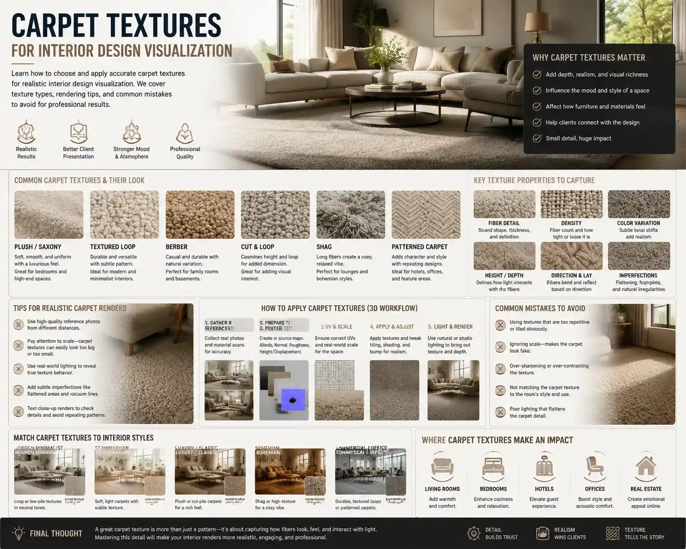
Common Carpet Texture Types and How to Visualize Them Accurately
Not all carpets are created equal, and each common texture has unique characteristics that require specific approaches in visualization. Below are the most popular carpet textures used in modern interior design, and how to render them to feel authentic.
Plush (Cut Pile) Carpet
Plush carpet, also called cut pile, is the most common choice for bedrooms and formal living rooms. It’s made by cutting the fiber loops to create a smooth, even surface that feels soft underfoot. There are two sub-types of plush: solid plush, which has a uniform look, and textured plush, which has subtle variations in fiber twist to hide footprints and vacuum marks.
For visualization, the key detail to get right with plush carpet is the way light interacts with the surface. While it looks relatively smooth from a distance, close up, individual fibers create subtle shadows and highlights. Avoid making the surface too uniform—add slight variations in hue and height to mimic the way fibers shift when stepped on. For formal plush textures, keep the variation subtle; for textured plush, you can increase the fiber height variation to show the stain-hiding pattern.
Shag and High-Pile Carpet
Shag and high-pile carpets have seen a major resurgence in recent years, popular for bohemian, mid-century modern, and cozy contemporary designs. These carpets have long fibers (usually between 1 inch and 3 inches) that create a fluffy, uneven surface with deep gaps between fibers.
This is one of the hardest textures to render correctly, because the depth of the pile creates dramatic shadows that change based on lighting. Many new 3D artists make the mistake of making shag carpet look uniform and fuzzy, rather than capturing the individual clumps of fiber and the deep shadowed areas between them. For realistic results, use displacement mapping to add actual height variation to the surface, rather than just relying on a diffuse texture map. In natural light, the tops of the fibers will catch highlights, while the bases will be significantly darker—don’t be afraid to increase the contrast between these areas to sell the effect.
Berber (Loop Pile) Carpet
Berber or loop pile carpet is made of uncut fiber loops, creating a textured, durable surface that’s popular for basements, family rooms, and casual commercial spaces. Traditional Berber has small, uniform loops, often with flecks of darker fiber to hide wear. Modern variations include large-loop Berber, which has a more chunky, textured look.
The key to visualizing Berber is emphasizing the repeating loop pattern and the way light reflects off the curved surface of each loop. Unlike cut pile, which has a soft, diffused reflection, Berber loops create small, distinct highlights on the top of each loop. Keep the texture consistent across the surface for small-loop Berber, and add slight variations in loop size for chunky modern Berber to avoid a manufactured, artificial look. The flecks common in traditional Berber should be subtle—don’t let them overpower the overall texture, or they’ll look garish in the render.
Flatweave and Woven Carpet
Flatweave carpets (including kilims and dhurries) are thin, tightly woven with no pile, making them popular for area rugs in dining rooms, entryways, and minimalist spaces. They often feature bold geometric patterns woven directly into the fiber, rather than printed on top.
For visualization, the most important detail is the subtle texture of the weave itself. Even a solid-colored flatweave has a visible grid of interlaced fibers that gives it depth, so don’t render it as a completely flat surface. If the carpet has a woven pattern, make sure the pattern follows the perspective of the room—many 3D artists make the mistake of stretching patterns incorrectly, which immediately breaks realism. Because flatweave sits low to the ground, it reflects more light than high-pile carpet, so adjust your gloss map accordingly to get a subtle, natural sheen.
Patterned and Textured Weave Carpet
Patterned carpets combine cut and loop fibers to create repeating designs, from subtle pin dots to large damask patterns. These are popular for formal dining rooms and traditional living rooms, as they add visual interest without being as bold as a printed pattern.
To render patterned cut-and-loop carpet correctly, emphasize the contrast in height between the cut and loop sections. The cut sections will be slightly higher and softer, while the loop sections are lower and more reflective. This creates a subtle shadow effect that makes the pattern visible even in solid neutral colors, which is the defining characteristic of this texture. Avoid making the pattern too sharp—remember that it’s created by differences in fiber texture, not just printed color, so the edges of the pattern should be soft.
Key Principles for Matching Carpet Texture to Design Style
Accuracy is important, but visualization also requires making intentional choices that align with the overall design concept. The wrong carpet texture can throw off an otherwise perfectly designed room, even if it’s rendered realistically. Below are practical guidelines for matching carpet texture to common interior design styles:
- Minimalist and Scandinavian design: Stick to low-pile textures like flatweave or textured plush. Avoid high-contrast patterns or thick shag, which can feel overwhelming in a minimalist space. Light neutral tones with subtle fiber variation add warmth without cluttering the visual field.
- Mid-century modern design: A chunky Berber loop pile or a low, dense shag works perfectly for mid-century living rooms, especially under a iconic teak sofa. Stick to warm neutral tones or subtle geometric patterns to complement the clean lines of mid-century furniture.
- Bohemian and eclectic design: Layering is key here. Pair a high-pile shag base rug with a flatweave kilim on top for visual and textural interest. Bold woven patterns and uneven handwoven textures add to the relaxed, collected vibe of bohemian spaces.
- Traditional and formal design: Plush cut pile or patterned cut-and-loop carpet is the go-to for traditional interiors. A uniform, smooth plush adds a luxurious feel to formal dining rooms and entryways, while subtle damask patterns complement classic furniture silhouettes.
- Industrial and contemporary design: Low-pile loop Berber or flatweave in cool neutral tones pairs perfectly with exposed brick and metal accents. The durability and casual texture of Berber balances the hard edges of industrial design.

Another key principle is matching texture to the room’s function. A high-traffic entryway or home office will almost always use a low-pile, durable texture like Berber or textured plush, while a bedroom will prioritize softness with plush or shag. If you’re visualizing a family home with young children or pets, a textured plush with stain-hiding fiber variation is far more realistic than a high-maintenance solid plush. Getting these functional details right helps clients see themselves living in the space, which is the ultimate goal of any interior design visualization.
"A room is not just a collection of shapes and colors—it’s a collection of experiences waiting to happen. Carpet texture is the first thing you feel when you walk into a room, even before you touch it. If your visualization doesn’t capture that feeling, you haven’t finished telling the story of the design."
Common Mistakes in Carpet Texture Visualization (And How to Fix Them)
Even experienced 3D artists and designers make consistent mistakes when working with carpet textures that can reduce the quality of a render. Recognizing these mistakes is the first step to avoiding them in your own work.
Mistake 1: Uniform Texture With No Variation
The most common mistake is rendering carpet as a completely uniform surface, with no variation in fiber height or color. In real life, even the most well-made factory carpet has slight variations in fiber, from foot traffic to the manufacturing process. A uniform texture looks artificial and flat, because it doesn’t interact with light the way real carpet does.
How to fix it: Add a subtle noise map to your displacement and albedo maps to create natural variation. For cut pile and shag textures, increase the noise slightly to mimic the natural shift of fibers. You don’t need the variation to be obvious from across the room—even subtle changes will make the texture feel more real when light hits it.
Mistake 2: Incorrect Scale of Texture and Pattern
It’s easy to get the scale of a carpet texture wrong, especially when working with repeating patterns or looped weaves. A Berber carpet with loops that are too large will look like a coarse doormat in a render, while loops that are too small will read as a uniform solid, losing all of their textural character. The same applies to patterns: a damask pattern that’s too large will overwhelm the room, while a pattern that’s too small will just look like blurry noise.
How to fix it: Always reference real-world dimensions when creating your texture. A standard Berber loop is between 5mm and 10mm in diameter, so adjust your texture scale to match. Place a common object like a coffee table or sofa next to the carpet in your 3D model and check the scale from the camera’s perspective before finalizing your render. It helps to keep a library of physical carpet samples you can reference to check the size of patterns and fibers.
Mistake 3: Wrong Reflection and Gloss Settings
Carpet is a porous, matte surface, but many new artists make the mistake of setting it to be too glossy, or not reflective enough. Too much gloss makes carpet look like plastic or vinyl, while zero reflection makes it look flat and dead. The level of reflection depends entirely on the texture: high-pile shag is very matte, while flatweave and loop pile have a subtle sheen.
How to fix it: Adjust your gloss value based on the carpet type. For shag and plush, keep gloss very low (between 0.02 and 0.05 on a 0 to 1 scale). For flatweave and Berber, increase it slightly to between 0.05 and 0.1. Remember that reflection isn’t the same as gloss—even matte carpet reflects some ambient light from the room, so add subtle indirect reflection to capture the way fibers interact with the surrounding space.
Mistake 4: Ignoring Perspective and Distortion
When a carpet covers a large floor area, the texture and pattern should get smaller and less sharp as it recedes into the distance, following the rules of perspective. Many artists apply the same sharp, full-size texture across the entire floor, which makes the room feel distorted and the carpet feel unrealistic. This is especially noticeable with large area rugs placed on top of hardwood floors, where the edges of the rug can look wrong if the pattern isn’t adjusted for perspective.
How to fix it: Use UV mapping that matches the perspective of your scene, rather than using a uniform tiled texture across the entire floor. For wide-angle shots, add slight blurring to the texture in the distance to mimic the natural loss of detail that happens with real perspective. If you’re using a tiled texture for a large room, add subtle variation between tiles to avoid the obvious repeating pattern that gives away a digital texture.
Actionable Tips for Improving Your Carpet Texture Workflow
Whether you’re working with a library of pre-made textures or creating your own from scratch, there are practical steps you can take to improve your results and speed up your workflow. These tips are used by professional visualization artists to create consistently realistic carpet renders:
- Build a reference library of physical and digital carpet samples. Collect physical carpet swatches from local suppliers and photograph them in different lighting conditions (natural daylight, warm artificial light, cool artificial light) to use as reference. You can also find high-resolution photos of carpet textures on stock photography sites, but photographing your own samples gives you more accurate reference for how the texture looks in different lighting. Store your reference library organized by texture type so you can pull it up quickly when working on a new project.
- Use displacement mapping instead of just bump mapping for high-pile textures. Bump mapping only creates the illusion of height by changing the surface normals, while displacement mapping actually changes the geometry of the surface to create real depth. For shag and high-pile carpet, this creates far more realistic shadows and light interaction, especially in close-up shots. While it does require slightly more processing power, modern GPUs can handle displacement mapping for large floor areas without significant slowdown.
- Test your render in multiple lighting conditions before presenting to clients. Carpet texture looks very different in warm overhead light vs. cool natural light from a window. A texture that looks great in one lighting condition can look flat or muddy in another. Test your render with the lighting design that’s planned for the space, and adjust your texture’s contrast and color to match. For example, a dark plush carpet will absorb a lot of light in a dimly lit bedroom, so you may need to add subtle brightness to the fiber tops to keep the texture from becoming a uniform black blob.
- Add subtle wear and tear for lived-in spaces. If you’re visualizing a family home or a lived-in apartment, a brand-new uniform carpet feels unrealistic. Add subtle darker areas where foot traffic would be heavier (near the door, in front of the sofa) and slight fading to mimic the natural wear that happens over time. You don’t need to make the wear obvious—even subtle changes add a level of authenticity that makes the space feel more inviting.
- Adjust texture based on the camera distance. A close-up render of a sitting area needs much more detailed texture than a wide shot of an entire open-plan floor. For wide shots, you can use a lower-resolution texture with subtle variation, because viewers won’t see individual fibers anyway. For close-up shots, you need high-resolution texture with detailed fiber variation to keep the texture looking real. Adjusting your texture detail based on camera distance saves processing time and keeps your render looking sharp.
For designers who don’t create their own 3D renders, working with a 3D artist also requires communication about carpet texture. Make sure you share physical swatches or clear reference photos with your artist, and specify not just the color but the texture type and pile height. Vague descriptions like “soft carpet” can lead to misinterpretation—specific reference eliminates that problem and saves time on revisions.
Conclusion
Carpet texture is far more than a minor detail in interior design visualization—it’s a core element that adds realism, communicates style, and helps viewers connect emotionally with a space. From the fluffy depth of a shag rug to the tight weave of a flatweave kilim, each texture has unique characteristics that require intentional, careful rendering to get right. By understanding the different types of carpet texture, matching them to the right design style and function, avoiding common mistakes, and following a intentional workflow, you can create visualizations that feel tangible and inviting.
The next time you start a new interior visualization project, take a step back before you render and consider what the carpet texture brings to the space. The extra time you spend getting the texture right will pay off in a final render that wows clients and effectively communicates your design vision. After all, great interior design is about how a space feels as much as how it looks—and carpet texture is the key to capturing that feeling in a digital visualization.