
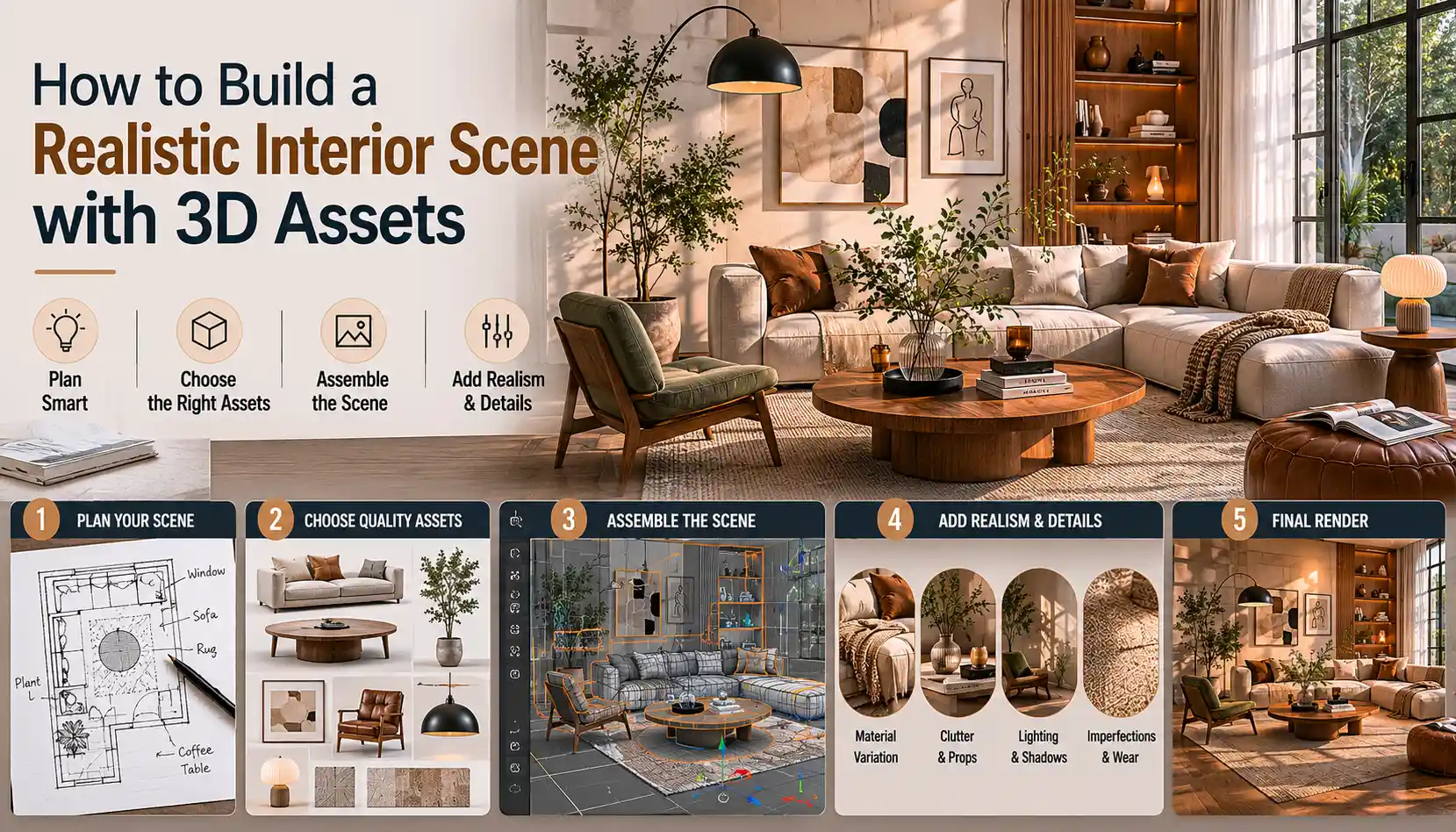
Creating a realistic 3D interior scene that feels lived-in, believable, and visually compelling is one of the most satisfying skills a 3D artist can master. Whether you’re working on an architectural visualization project, a game environment, a product render, or a personal art piece, the difference between a flat, lifeless scene and one that makes viewers lean in comes down to intentional planning, smart asset choices, and attention to small, realistic details. Many new artists assume that buying high-end 3D assets is enough to get a great result, but realism actually comes from how you combine, adjust, and contextualize those assets to match how real spaces work. In this guide, we’ll walk through every step of building a realistic interior scene from initial concept to final tweaks, using free and paid 3D assets to get professional results.
Start with a Clear Concept and Reference Plan
Before you download a single 3D asset or open your modeling software, you need a clear vision for your space. A random collection of furniture and decor will always feel disjointed, no matter how good individual assets are. Real interiors are designed around a specific purpose, a consistent style, and the people who use them, so your concept should reflect that.
Define the space’s purpose and style
Start by answering two core questions: What is this room used for, and what aesthetic does it follow? A small urban studio apartment for a recent college graduate will look completely different from a traditional country kitchen for a family of five, or a minimalist luxury home office for a CEO. Defining these parameters narrows down your asset search and keeps your scene cohesive. For example, a 2020s modern Scandinavian living room calls for low-profile modular sofas, natural fiber rugs, and minimal clutter, while a 1970s vintage family room needs bulky tufted seating, shag carpets, and patterned wallpaper.
Gather accurate reference material
Even the most experienced 3D artists rely on reference photos to capture realistic proportions, lighting, and detail. Real rooms have quirks that generic 3D assets don’t account for, so references help you avoid the “too perfect” look that plagues many beginner scenes. Great places to find references include:
- Interior design platforms like Pinterest, Architectural Digest, and Apartment Therapy, which feature professionally styled photos of complete rooms
- Real estate listing sites like Zillow or Rightmove, which show un-staged, lived-in spaces with the kind of everyday clutter that adds realism
- Unsplash and Pexels for high-resolution, free photos of real interiors that you can study for lighting and detail
Once you’ve gathered 5-10 strong references, create a mood board to keep open as you work. Pay attention to small details: how furniture is arranged, where cords are placed, how light hits different surfaces, and what kind of wear shows on high-use items like sofa cushions or doorknobs.
“The biggest mistake new 3D artists make is trying to create a perfect room. Real rooms aren’t perfect – they’re lived in. References show you that imperfection, and that’s where realism lives.”
Block out the room first
Before adding any assets, build a basic blockout of your room to test proportions and layout. A common beginner mistake is using assets that don’t fit the space: a sofa that’s too big for a small living room, or a dining table that leaves no room for chairs to pull out. Start by creating simple primitive shapes (cubes for walls, a thin cube for the floor, another for the ceiling) and mark out openings for doors and windows. Then add basic primitives for large key pieces like sofas, beds, or tables to test how they fit.
For reference, standard room proportions in most Western countries are 8-10 foot (2.4-3 meter) ceilings, 36 inch (90cm) wide doorways, and 30 inch (75cm) wide walkways between furniture. Blocking out helps you catch proportion errors early, before you spend time importing and adjusting hundreds of assets.
Source and Curate High-Quality Compatible 3D Assets
One of the biggest advantages of working with pre-made 3D assets is that it saves you hours of modeling from scratch, but not all assets are created equal. A single low-poly, poorly textured asset can break the realism of an entire scene, so curation is just as important as sourcing. Where you find your assets depends on your budget, your software, and the level of detail you need.
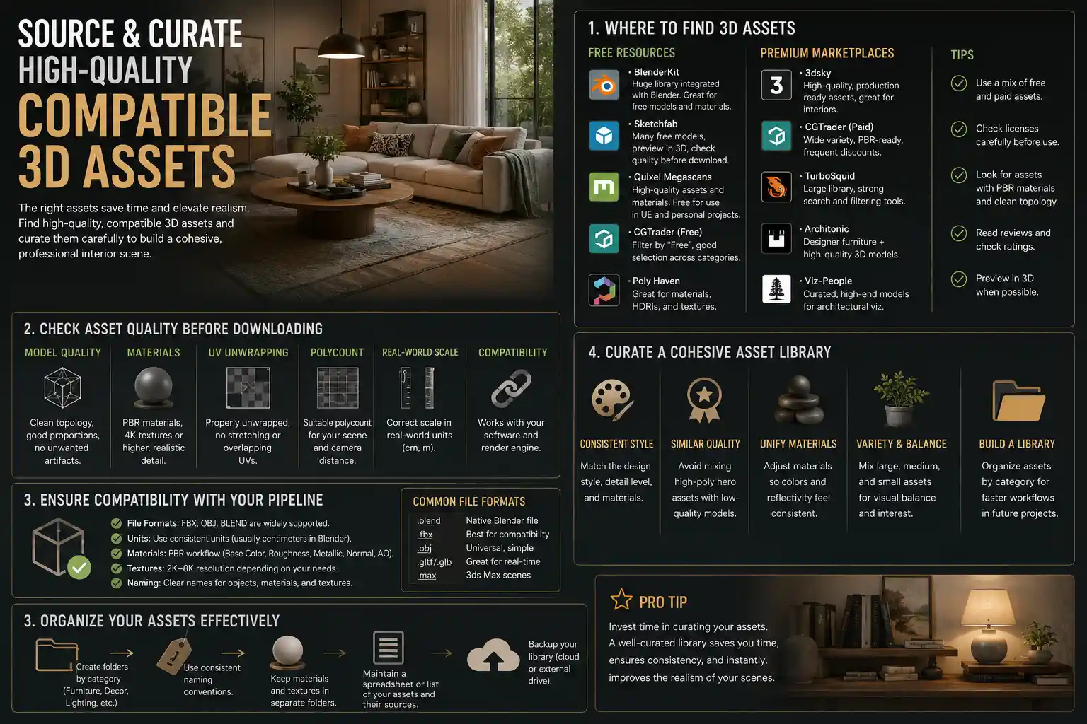
Where to find reliable 3D interior assets
There are dozens of marketplaces and free resources for interior assets, but some are more consistent than others. For most artists, these are the go-to sources:
- Paid marketplaces: Sites like TurboSquid, CGTrader, Sketchfab, and Hum3D offer high-quality, professionally made assets that are usually correctly scaled and textured. Many assets come with multiple LODs (level of detail) and PBR (physically based rendering) textures, which are essential for realistic lighting. For architectural visualization, sites like 3Dsky and Poliigon also offer pre-made asset packs for entire rooms, as well as individual furniture and decor pieces.
- Free resources: If you’re working on a personal project or on a tight budget, Google Poly, Sketchfab’s free section, and BlenderKit offer thousands of free PBR assets for interiors. Many independent artists also release free assets on Gumroad or Patreon, which can be a great way to build a library without spending money.
- Software-specific libraries: Tools like Blender, 3ds Max, and SketchUp have built-in asset libraries or community repositories that let you download assets directly into your project, which saves time on file conversion and compatibility fixes.
Check asset compatibility and quality before importing
Nothing derails a project faster than importing an asset only to find it’s the wrong scale, has missing textures, or is so high-poly that it crashes your software. Before adding any asset to your scene, check a few key details:
- Scale: Does the asset list real-world dimensions? A standard dining chair is 18 inches (45cm) high, so if the asset is listed as 10 feet tall, you’ll know you need to adjust it before importing.
- Polygon count: If you’re working on a game scene, you need low-poly assets that run smoothly in real time. For a still render, you can afford high-poly assets with intricate detail, but too many high-poly assets will slow your workflow down.
- Texture quality: Look for assets that come with 4K PBR texture sets, including albedo, roughness, normal, and displacement maps. These are required for realistic rendering in almost all modern render engines like Blender Cycles, V-Ray, or Unreal Engine.
Limit your asset sources for consistency
A common mistake new artists make is downloading assets from 10 different sources, each with slightly different scale, texturing, and aesthetic. Even if each asset is high quality on its own, mixing too many styles will make your scene feel disjointed. Instead, try to source most of your assets from 1-2 marketplaces or asset packs that match your scene’s style. For example, if you’re building a mid-century modern scene, a single mid-century asset pack from Hum3D will have all the furniture you need, with consistent scaling and texturing that matches across pieces.
Arrange Assets for Realistic Flow and Function
Once you have all your assets sourced and imported, it’s time to arrange them in your blocked-out room. Realistic arrangement doesn’t just mean putting furniture against walls – it means creating a space that feels like it’s actually used. A well-arranged scene guides the viewer’s eye and tells a story about the person who lives there.
Start with large anchor assets first
Always start arranging with your largest, most functional assets first, then fill in with smaller decor pieces. For a living room, that means starting with the sofa, then the coffee table, then side tables, then lighting, then decor. For a kitchen, start with cabinetry, then appliances, then countertops, then small kitchen items. This ensures you have enough space for the most important pieces, and you don’t end up with a sofa that doesn’t fit because you filled the room with small decor first.
When placing anchor assets, avoid pushing every piece flush against the wall. In real homes, most people pull sofas a few inches away from the wall to make the space feel more cozy and to make room for baseboards. Even just a 2-3 inch (5-8cm) gap between the back of a sofa and the wall makes the scene feel more natural.
Follow interior design rules (then break them intentionally)
Basic interior design principles create a space that feels intuitive and comfortable, which translates to realism in 3D. Some core rules to follow:
- Leave at least 30 inches (75cm) of clear space for walkways between furniture and doors. You shouldn’t have to squeeze between a coffee table and a sofa to get to the couch.
- Center larger furniture (like sofas or beds) with key architectural features, like a window or a fireplace, if that makes sense for the layout.
- Hang art at eye level (roughly 57-60 inches / 145-150cm from the floor to the center of the art), which is the standard in most real homes.
Once you’ve followed the basic rules, break one or two intentionally to add realism. Maybe a piece of art is slightly crooked because it hasn’t been adjusted in years. Maybe a chair is pulled out halfway from the dining table because someone just got up to get a drink. Small, intentional deviations from perfection make the space feel lived-in, not designed by a computer.
Add hierarchy to your decor
Real rooms don’t have decor spread evenly across every surface. Instead, they have grouped collections that create visual interest. A common rule of thumb for styling is the “rule of three,” which says that groups of odd numbers are more visually appealing and feel more natural than even numbers. For example, group three small decor items on a coffee table: a candle, a book, and a small plant, instead of two or four.
Also, leave empty space on shelves and countertops. Too much clutter makes a scene feel busy and fake, while intentional empty space mimics how real people organize their homes. Most people don’t fill every single inch of shelf space – they leave room for new items, or just prefer a less cluttered look.
Adjust Textures and Add Imperfections for Realism
Even the highest quality 3D assets will look fake if you use them exactly as they are downloaded. Factory-new, perfectly clean, flawlessly textured everything is not what real interiors look like. The secret to making assets feel real is adjusting their textures and adding small imperfections that match how the space is used.
Match texture scale across your scene
One of the most common subtle mistakes that breaks realism is incorrect texture scale. For example, a wood floor texture that’s meant for a large floor might be scaled too small, making the planks look tiny like toy flooring. Or a brick backsplash texture might be scaled too large, making the bricks look bigger than a human head. When you add any material to a surface, double-check that the texture scale matches real-world dimensions. A standard 12x12 inch (30x30cm) floor tile should be exactly that size in your texture map.
Also, adjust roughness values to match real materials. A common mistake is making all surfaces too shiny or too matte. For example, a matte wall should have a high roughness value, while a glazed ceramic tile should have a low roughness value. Even wood has subtle variation: a worn oak table will be less rough (more shiny) in areas where hands touch it often, while the edges will be more matte.
Add wear and tear to high-use assets
Every object in a home gets used, and that use leaves marks. Adding subtle wear to your assets makes them feel like they’ve been in the space for years, instead of just being unboxed. Some easy imperfections to add include:
- Scuffs and scratches on the bottom legs of chairs and tables, where they rub against the floor
- Faded spots on sofa cushions where the sun hits them regularly, or where people sit most often
- Water rings on wooden coffee tables from cold glasses
- Chipped paint on baseboards or door frames from moving furniture
- Worn edges on book spines on a bookshelf
You don’t have to model these from scratch. Most sites like Poliigon sell texture overlays for scratches, scuffs, and dirt that you can overlay on your existing textures to add imperfections in a few clicks. The key is to keep it subtle – too many scratches will look fake, but a few well-placed marks add a huge amount of realism.
Fix texture repetition
Large continuous surfaces like floors, walls, and countertops almost always use repeating textures, and if the repetition is obvious, it immediately breaks immersion. To fix this, use a few simple tricks:
- Rotate or flip every other tile in your texture map so the pattern doesn’t line up perfectly.
- Add a subtle grunge or noise overlay over the entire texture to break up the repeating pattern.
- Use texture blending to mix two slightly different versions of the same texture, so the repeat is less noticeable.
For example, if you’re using a hardwood floor texture, adding a subtle noise map that varies the brightness of individual planks makes the repetition much harder to spot, even in a large open living room.
Light and Render Your Scene to Enhance Realism
Lighting makes or breaks a realistic interior scene. You can have perfectly arranged assets and perfect textures, but bad lighting will make the whole scene feel flat and fake. Real interior lighting is a mix of natural light from windows and artificial light from lamps, overhead fixtures, and ambient bounce from walls.
Start with natural light as your base
Most interiors are dominated by natural light during the day, so start by setting up your window light first, before adding any artificial lights. Match the direction and quality of light to the time of day in your concept: morning light is warmer and lower in the sky, while midday light is cooler and brighter, and late afternoon light is golden and warm.
Add a subtle soft shadow to objects near windows, and make sure the light falloff is natural – light gets dimmer the further it gets from the window, not uniformly bright across the entire room. Also, don’t forget that light bounces: if you have a blue wall near a window, the bounced light will cast a subtle blue tint on nearby objects, which is called color bleeding. Modern render engines like Cycles and V-Ray handle this automatically if you enable global illumination, but it’s something to look out for – the effect should be subtle, not overwhelming.
Layer artificial light for depth
After setting up your natural light, add artificial lights to fill in dark areas and create depth. Real interiors have multiple light sources, not just a single overhead light. For example, a living room might have an overhead pendant light, two table lamps on side tables, and a small accent lamp behind a bookshelf for mood. Layered lighting creates soft shadows and highlights that draw attention to different parts of the scene and make it feel more natural.
Match the color temperature of your artificial lights to their type: warm white (2700K-3000K) for most incandescent or LED bulbs in living spaces, which feels cozy, and cooler white (4000K-5000K) for task lighting in kitchens or home offices. Avoid using pure white light – almost all real artificial light has a subtle warm or cool tint.
Add small atmospheric details
Small atmospheric details add a sense of depth and realism that makes your scene feel tangible. For example, if your scene is set during the day with bright sunlight coming through a window, add a subtle dust or haze effect to the light beam. You don’t need to make it thick like a fog – just a subtle amount that’s visible where the sun hits makes the air feel real instead of empty. Other atmospheric details include:
- Subtle shadows from window frames or blinds on walls and floors
- A warm glow from lamp shades that tints the nearby wall or ceiling
- Reflections of nearby objects in glass surfaces like mirrors, coffee tables, or window panes
- Subtle depth of field for still renders, where the foreground is slightly blurred and the focal point is sharp, which mimics how the human eye sees a space
When you’re ready to render, use a high enough sample count to eliminate noise, especially in shadow areas. Noisy shadows look unprofessional, so it’s worth waiting a few extra minutes for a clean render.
Conclusion
Building a realistic interior scene with 3D assets doesn’t require you to model every piece from scratch or have a six-figure software budget. It requires intentional planning, careful curation, and attention to the small, messy details that make real spaces feel lived-in. Start with a clear concept and reference to keep your work cohesive, source assets that match your style and are compatible with your workflow, arrange them to feel functional instead of perfectly staged, add subtle imperfections that come with use, and light your scene to create depth and atmosphere. The best realistic 3D interiors don’t just show a room – they tell a story about the person who uses it, and that’s what makes them feel real. By following these steps, you’ll be able to create compelling, believable interior scenes that stand out, whether you’re working professionally or on a personal project.