
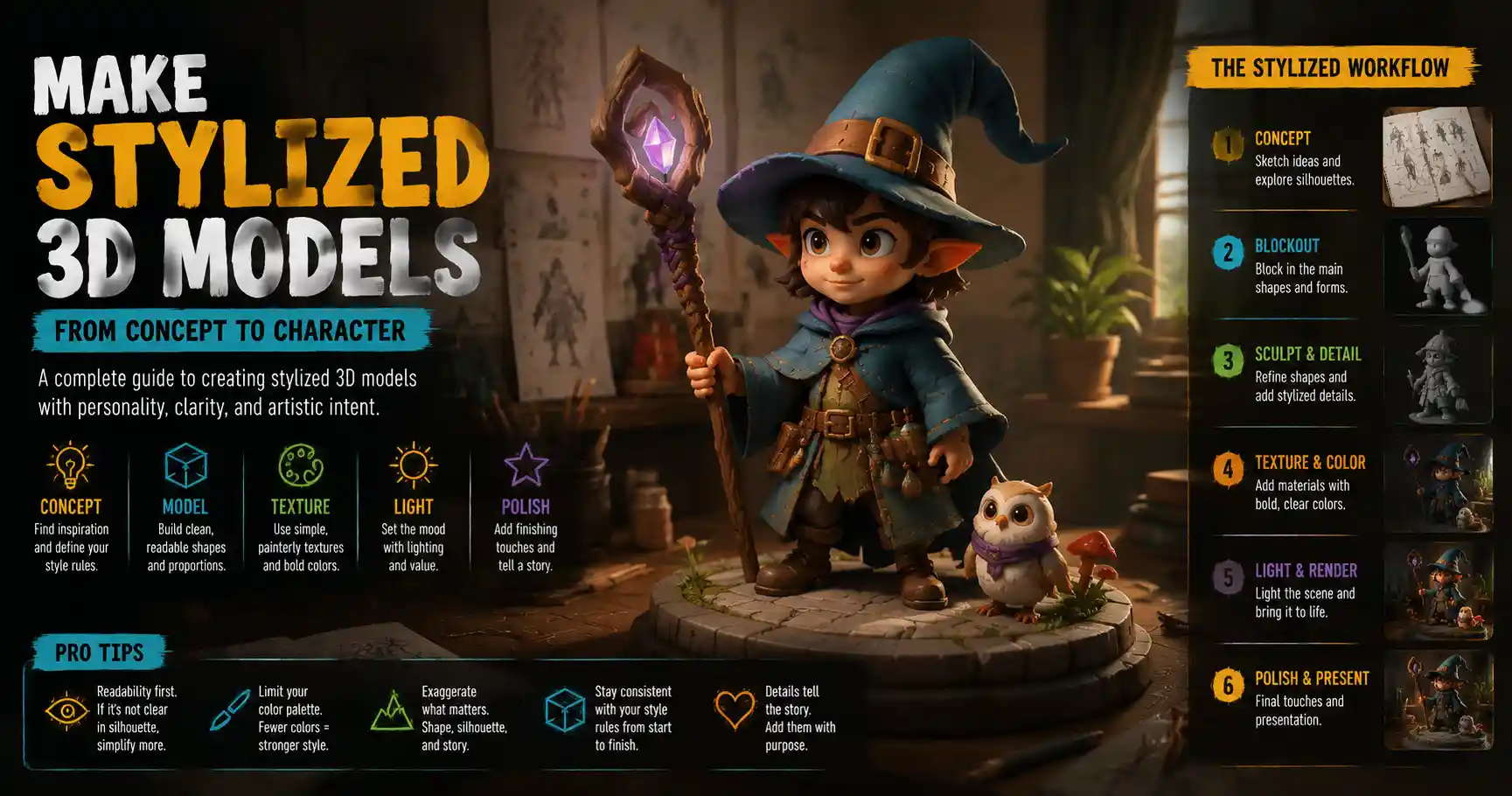
If you’ve ever scrolled through a indie game demo reel, admired a character design for a animated short, or stopped to stare at a whimsical product render, chances are you’ve encountered stylized 3D models. Unlike photorealistic 3D art that aims to replicate real life down to the last skin pore or fabric weave, stylized 3D prioritizes artistic interpretation, personality, and intentional simplification. It’s the style that brought The Legend of Zelda: Breath of the Wild’s colorful Hyrule to life, gave Spider-Man: Into the Spider-Verse its distinct comic-book energy, and makes small-batch 3D printed figurines feel one-of-a-kind. Whether you’re a beginner 3D artist looking to move past basic primitive shapes or a seasoned pro wanting to pivot from photorealism to something more expressive, learning to make compelling stylized 3D models relies on core principles that anyone can master with practice. This guide breaks down the entire process, from initial concept to final touches, to help you create stylized work that stands out.
Start With a Clear Stylistic Foundation
Stylization isn’t just “doing whatever looks cool” — the most memorable stylized 3D models start with a intentional vision. Before you even open Blender, ZBrush, or any 3D software, you need to define what style you’re aiming for, and what core rules you’ll stick to throughout the process. Without this foundation, it’s easy to end up with a disjointed model that mixes conflicting design choices and feels unfocused.
Define your style reference
There are dozens of popular stylized 3D sub-styles, from cartoonish chibi to minimalist low-poly to painterly impressionism. Jumping in without references is one of the most common mistakes new artists make. Instead, gather 3–5 reference images that capture the exact feel you want. These don’t even have to be 3D models: 2D concept art, illustrations, vintage cartoons, or even architecture and textile designs can be great references. For example, if you want to make a stylized cottage, you might pull references from Studio Ghibli’s soft, rounded environmental design, 1950s children’s book illustrations, and a photo of a crooked stone cottage in the English countryside to ground the design in personality.
Identify your core simplification rules
At its core, stylization is about intentional simplification: you cut out non-essential details to emphasize the features that matter most to your design. The key word here is intentional — simplification isn’t about being lazy, it’s about making deliberate choices. For example:
- If you’re creating a stylized heroic character, you might exaggerate the size of their shoulders and jaw while simplifying the details of their hands and facial wrinkles to emphasize strength.
- If you’re making a stylized low-poly environment, you might decide to use no more than three geometric shapes per tree, and limit your color palette to 5 hues total to keep the design cohesive.
- If you’re working in a chibi style, you’ll simplify the body to 2–3 head heights total, exaggerating the size of the head and eyes to cuteness.
Write down 2–3 non-negotiable rules for your model before you start modeling. For example: “All edges will be rounded, no hard angles” or “I will only use two values per color to keep shading simple.” These rules will keep you consistent when you’re tempted to add extra details that don’t serve the style.
“Stylization is not the opposite of realism. It is a refinement of realism. You take what is necessary, you leave out what is not, and you amplify what makes the subject unique.”
— Scott Robertson, concept artist and author of How to Draw
Sketch your concept first
Even if you can barely draw a stick figure, a quick 2D sketch of your concept will save you hours of reworking in 3D. You don’t need a polished illustration: just a few rough silhouettes to test proportions and composition. Silhouette is especially important for stylized work, because a strong, readable silhouette is what makes your model recognizable from far away. If your silhouette is messy or unclear, even great texturing won’t save the final design. Test your silhouette by filling your sketch with solid black and stepping back: can you tell what the model is at a glance? If not, adjust your proportions before you start modeling.
Blocking and Base Mesh Modeling for Stylized Shapes
Once you have your concept nailed down, it’s time to move into 3D. The blocking phase is where you translate your 2D sketch into a basic 3D base mesh, and this is where most of the stylistic work happens. In photorealistic work, you start with accurate real-world proportions and add detail from there. In stylized work, you start with exaggerated, simplified proportions, and only refine within the rules you set earlier.
Start with big shapes, ignore small details
Just like with 2D concepting, start with the largest shapes first. If you’re making a character, block out the head, torso, hips, and major limbs before you add fingers, ears, or facial features. If you’re making a prop like a stylized sword, block out the overall blade and hilt shape before you add a pommel or engravings. This approach keeps you focused on the overall proportions and silhouette, which are far more important to good stylized design than small details.
A common trick for testing your big shapes is to view your model in orthographic mode with a solid black material. Just like with your 2D silhouette test, this lets you see if your overall shape reads correctly. If you’re working on a character, rotate the view to front, side, and back to check each silhouette. For example, if you’re making a stylized wizard, a side view silhouette should immediately read “tall hat, flowing robes, bent staff” without any extra detail. If it doesn’t, adjust the big shapes before moving on.
Exaggerate intentionally to emphasize personality
Exaggeration is the heart of stylized 3D. It’s what gives your model personality, and communicates what the subject is all about at a glance. The key is to exaggerate features that matter, and simplify or even remove features that don’t. For example:
- If your character is a grumpy old blacksmith, you might exaggerate the size of his forearms, the slump of his shoulders, and the deep ridge of his brow to communicate his gruff nature. You can simplify the size of his eyes and smooth out small wrinkles to keep the design clean.
- If your prop is a stylized strawberry for a children’s game, you might exaggerate the roundness of the fruit, make the leaf cap larger than real life, and make the seeds extra prominent to reinforce the recognizable shape.
- If your environment is a stylized mountain range, you might exaggerate the height of the peaks and exaggerate the curve of the valleys to create a more dramatic, dynamic composition than you’d see in real life.
A good rule of thumb is to exaggerate more than you think you need to, then pull it back 10% once you see it in 3D. It’s easy to under-exaggerate when you’re working close up, so stepping back and viewing the model from a distance will help you see if the exaggeration reads correctly.
Topology tips for stylized models
Topology (the arrangement of polygons that make up your 3D mesh) doesn’t have to be as precise for stylized models as it is for photorealistic characters that need to deform for animation, but there are a few key guidelines to follow:
- Keep your polygon count as low as you can while holding your shape. There’s no need for extra edge loops if they don’t change the overall silhouette of your model. This keeps your file clean and makes texturing easier.
- Add more edge loops only around areas where you need a sharp or rounded shape. For example, if you have a stylized character with a big rounded nose, you’ll need a few extra edge loops to get that smooth curve, but you can leave the back of the head with far fewer polygons.
- If you plan to subdivide your mesh to get smooth edges, keep your base mesh polygons evenly sized to avoid weird creasing. Most stylized models benefit from subdivision, since soft rounded edges are a common feature of many stylized styles.
Retopology and Details: Add Only What Serves the Style
Once you’re happy with your blocked-out base shape, it’s time to add small details — but here’s the thing about stylized 3D: less is almost always more. Adding too many details can clutter your design and pull focus away from the core silhouette and personality you worked so hard to create. The goal is to add only details that support your stylistic vision, not every detail that exists in real life.
Decide what level of detail is right for your style
Different styles require different levels of detail. A low-poly mobile game asset will need far less detail than a high-resolution sculpt for a printed figurine. Before you start adding details, remind yourself of your core style rules. If your rule is “all details are bold and simplified,” then you don’t need to add fine skin pores or tiny fabric weave to your character.
For example, if you’re working on a stylized wooden chest:- A low-poly style might only add a single cube for the lock and a few indentations for the wood planks.- A mid-poly cartoony style might add a carved border around the lid, a slightly rounded lock shape, and a few bold cracks in the wood.- A high-resolution painterly stylized style might add more variation to the wood grain, a rusted texture on the lock, and small chips out of the edge of the lid — but even then, you’d keep those details bold and simplified, not photorealistic.
Sculpting details for stylized models
If you’re working with a high-resolution sculpt in ZBrush or Blender, the same rule of intentional exaggeration applies. For example, if you’re adding wrinkles to a stylized character’s clothing, make the wrinkles big, bold, and spaced far apart, instead of dozens of tiny thin wrinkles like you’d use for photorealism. Each wrinkle should contribute to the overall pose and personality: a deep wrinkle across the chest can show that the character is hunched over, while big loose wrinkles on sleeves can show that the robe is flowing and oversized.
One common trick that stylized 3D artists use is panel loops or bold edge highlights built into the mesh. For example, you can slightly bevel the edge of a stylized sword blade so that when you add texturing, the edge catches the light and creates a clean, bold outline that reinforces the shape. This works especially well for cartoon and anime-inspired styles, where clear outlines are a core design feature.
Retopology and UV unwrapping best practices
Once you’re done adding details, you’ll need to retopologize your high-res sculpt to get a clean, animation-ready low-poly mesh if you’re working for games or animation. For stylized models, you can follow the same basic retopology rules as any other project, but you can often get away with fewer polygons, since you’ve already simplified your design. When it comes to UV unwrapping, leave plenty of space in your UV map for the areas that have the most detail. For example, a character’s face will need more UV space than the back of their shirt, since the face has more important details that need to be clear.
One tip for stylized models that use hand-painted textures: make your UV islands as big as possible, and avoid stretching. Stretched UVs will make your hand-painted details look blurry or warped, which ruins the clean, intentional look of stylized work. If you’re using PBR textures that you’ve adjusted for stylized work, the same rule applies: clean UVs make for clean textures.
Texturing and Shading: Bring Your Stylized Model to Life
Texturing and shading is where a lot of stylized 3D models really stand out — or fall flat. Unlike photorealistic texturing, which relies on scanned real-world textures and complex lighting simulations, stylized texturing leans into artistic choice to reinforce your design and style. The goal isn’t to replicate real-world materials, it’s to use color, value, and texture to make your model read clearly and feel cohesive.
Choose a cohesive color palette
Color is one of the most important tools you have for stylized work. A limited, intentional color palette will make your model feel polished and cohesive, while a messy palette with too many competing hues will distract from your design. Most stylized artists work with a limited palette of 3–7 main hues, plus a few darker and lighter values of each hue. For example, a stylized forest environment might use three main greens (light, medium, dark), one brown for tree trunks, one blue for the sky, and one cream for mushrooms — that’s six total main hues, which keeps the design clean.
Another key tip for stylized color is to use value contrast to guide the viewer’s eye. Value is how light or dark a color is, and good value contrast makes your model readable even from far away. For example, if your character has a light-colored face, give them a dark-colored hood so the face stands out. If your prop is a golden sword against a dark leather sheath, the gold will pop and draw the viewer’s eye to the sword, which is the focal point. Avoid using similar values for adjacent areas unless you’re intentionally trying to create a muted, blended look.
Common stylized texturing approaches
There are three main texturing approaches used for stylized 3D models, and each works best for different styles:
- Hand-painted texturing: This is the most traditional approach for stylized work, where you paint all textures by hand in Photoshop, Substance Painter, or Blender. Hand-painting gives you full control over every detail, and lets you create bold, painterly, or cartoonish looks that are hard to get with procedural textures. It’s ideal for indie games, animated shorts, and 3D printed figurines. The key to good hand-painted texturing is to keep your brush strokes bold and consistent, avoid adding too many tiny random details, and reinforce your core shape with light and shadow.
- Stylized PBR: This approach uses physically based rendering (PBR) textures, but you adjust them to fit your stylistic vision. For example, you might take a scanned wood texture, desaturate it, increase the contrast, and simplify the details to make it fit a stylized environment. This approach is faster than hand-painting for large environments, and it still gives you a cohesive stylized look if you adjust all your textures consistently.
- Cel-shaded and toon texturing: This approach uses hard-edged shadow boundaries and simple color ramps to create a cartoon or anime look. Most 3D software has built-in toon shaders that you can adjust, but the key to a good cel-shaded look is to adjust the shadow thresholds to match your design, and add a clean outline around your model to reinforce the silhouette.
Shading tricks for stylized work
Shading in stylized 3D is all about clarity. A lot of new stylized artists make the mistake of using complex lighting that creates messy, random shadows that obscure the shape of the model. Instead, keep your lighting simple: use 2–3 light sources at most, and make sure the main light source creates a clear shadow that reinforces the shape of your model.
Another popular trick for stylized models is rim lighting — a bright light behind the model that creates a bright edge around the silhouette. This makes your model pop off the background, and reinforces the overall shape, which is especially useful for characters and props. For painterly stylized styles, many artists also add a slight curvature to their normals to make edges catch more light, which creates a soft, warm feel that’s very appealing.
If you’re working with hand-painted textures, don’t forget to add light and shadow directly into your albedo (base color) texture. This way, even if the lighting changes, the core shape and shading of your model stays consistent, which keeps your stylized look intact. A lot of successful stylized game artists do this, because it keeps the art looking consistent across different hardware and in-game lighting scenarios.
Final Polishing and Common Mistakes to Avoid
Once your model is modeled, textured, and shaded, it’s time for the final polish. This step is about stepping back, checking for inconsistencies, and fixing small issues that pull the viewer’s eye away from your design. It’s easy to get attached to your work and skip this step, but a few small tweaks can take a good stylized model and make it great.
Do a silhouette and readability check
Go back to the first test you did when you were blocking out your model: turn the model to solid black, and check the silhouette from all angles. Is it still clear and readable? If a small detail is sticking out and breaking the silhouette, ask yourself if it’s necessary. More often than not, you can remove it or adjust it to make the overall shape stronger.
Next, turn the image grayscale and check your value contrast. Do all the important parts of the model stand out? Is the focal point clear? If the character’s face gets lost against their hair because both are the same value, adjust one of them to be darker or lighter to create more contrast. This is a quick check that catches a lot of common readability issues that you can miss when you’re focused on color.
Check for consistency in your stylistic choices
Consistency is what makes a stylized model feel intentional. Go through your model and check that all your design choices follow the core rules you set at the beginning. For example, if you decided all edges would be rounded, do you have any hard edges that slipped in that don’t need to be there? If you decided you’d use a limited palette, do you have a random extra hue in a small detail that doesn’t need to be there?
A common inconsistency is mixing detailed and simplified areas. For example, you might have a character with a super detailed, realistic face but simplified hands and clothing. This creates a disjointed feel that pulls the viewer out of the style. If you’re going to have detailed areas, make sure the level of detail is consistent across the entire model, or intentionally make the focal point more detailed to draw the eye there.
Common mistakes new stylized artists make
Even with good planning, it’s easy to fall into common traps when you’re learning to make stylized 3D models. Here are the most frequent mistakes, and how to avoid them:
- Adding too much detail: As we’ve mentioned throughout this guide, more detail doesn’t equal better stylized art. If you’re unsure whether to keep a detail, cut it. You can always add it back later if it’s needed.
- Under-exaggerating proportions: A lot of new artists are scared to over-exaggerate, so they end up with a model that’s almost realistic but slightly off, which feels uncanny instead of stylized. Push your exaggeration further than you think you need to, then adjust.
- Ignoring silhouette: A great silhouette is the foundation of any good stylized model. If your silhouette is bad, even great texturing can’t fix it. Always check your silhouette early and often.
- Using too many colors: A messy color palette can ruin even a great shaped model. Limit your palette, and stick to it. A few well-chosen hues will always look better than a dozen competing ones.
Conclusion
Making great stylized 3D models isn’t about having the most expensive software or being the most talented sculptor. It’s about making intentional, consistent choices that prioritize personality and readability over unnecessary detail. Starting with a clear style foundation, blocking out strong shapes, exaggerating to emphasize personality, adding only details that serve your vision, and polishing with consistency in mind will help you create stylized 3D art that feels cohesive and memorable. The best way to improve is to practice: start small with a simple prop, apply the principles in this guide, and experiment with different styles to find what you love. Over time, you’ll develop your own unique stylized voice that makes your work stand out from the crowd.