
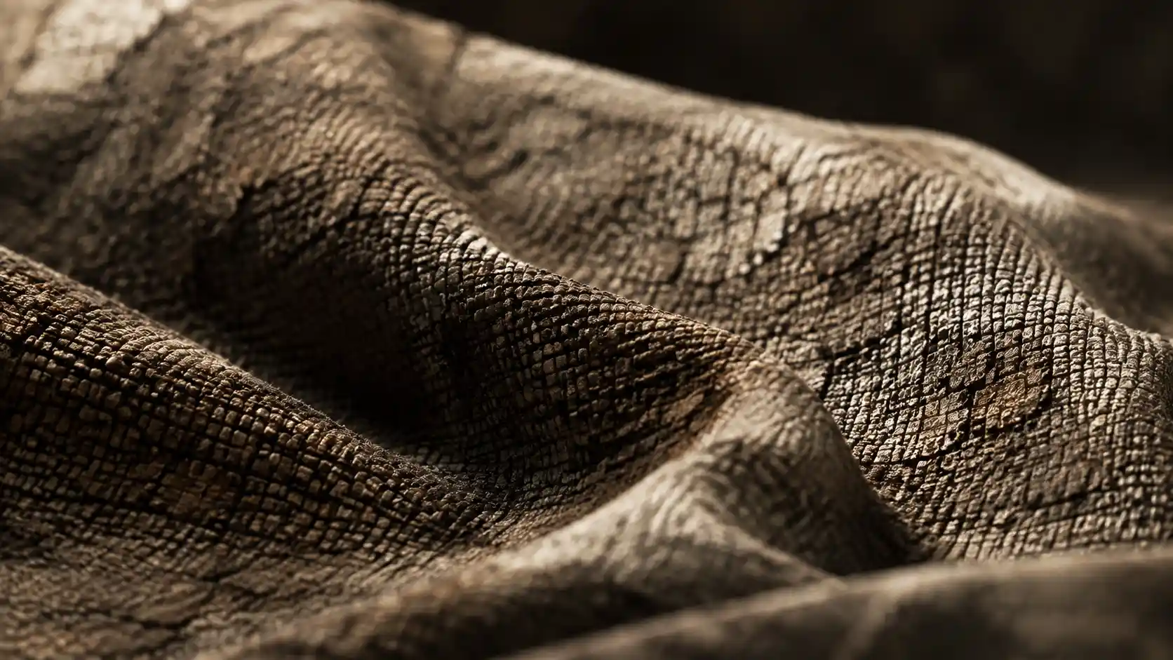
If you’ve ever looked at a 3D render of a plain gray cube and thought it looked lifeless and boring, you already understand why texturing is one of the most important steps in 3D modeling. A smooth, perfectly proportioned 3D model can feel like a generic prop without texture, while the right textures can turn a simple shape into a weathered wooden crate, a soft wool sweater, or a chipped concrete building that feels tangible enough to touch. Texturing adds depth, context, and realism to 3D work, whether you’re creating assets for video games, animated films, product visualizations, or 3D printing. For new 3D artists, the process can feel overwhelming: there are dozens of software tools, different texture types, and countless techniques to master. But once you break it down into manageable steps, adding texture to a 3D model becomes an intuitive, creative process that brings your work to life. This guide will walk you through every key step, from preparation to final polishing, with practical tips that work for artists of all skill levels.
Preparing Your Model and UV Unwrapping
Before you can add any texture to a 3D model, you need to lay the groundwork with proper preparation. The most critical step in this preparation phase is UV unwrapping, a process that flattens your 3D model’s surface into a 2D map so 2D texture images can be wrapped back around it correctly. Think of it like unwrapping a cardboard box to lay it flat: if the folds are misaligned or overlapping, the printed design on the box will end up distorted when you fold it back into shape. The same rule applies to 3D texturing.
Clean up your model firstBefore you even start UV unwrapping, make sure your 3D model is clean. Non-manifold geometry, overlapping faces, and extra vertices will cause problems when you unwrap and apply textures. Check for common issues like duplicated faces, flipped normals (which make the inside of your model visible to the camera instead of the outside), and unconnected edges. Most 3D software has built-in tools to automatically find and fix these issues: Blender has a “Find Non-Manifold” tool in Edit Mode, while Maya has the Cleanup tool under the Mesh menu. Taking 10 minutes to fix these problems early will save you hours of troubleshooting texture distortion later.
UV unwrapping best practicesThe goal of good UV unwrapping is to minimize texture distortion and maximize the use of your texture’s resolution. Distortion happens when a section of your 3D surface is stretched or squashed on the 2D UV map, which makes the texture look blurry or warped when applied. Follow these practical guidelines to get clean UVs:
- Seam placement: Place seams along natural edges of your model where they will be less visible. For example, put a seam along the inner edge of a character’s arm where it meets the torso, or along the bottom of a table leg instead of the visible front face.
- Group similar parts: Pack UV islands (the separate flattened pieces of your unwrapped model) so that parts that need more texture detail get more space in the UV map. A character’s face, for example, should get more UV space than the back of their head, since the face is more visible to viewers.
- Avoid over-stretching: Most software has a heatmap overlay that shows distortion: blue means low distortion (good), red means high distortion (bad). Adjust your UVs to pull stretched areas back into proportion until most of your model is blue or light green.
- Pack islands efficiently: Leave as little empty space as possible between UV islands to maximize the resolution of your texture. Empty space means you’re wasting pixels that could be adding sharp detail to your model.
For beginners, automatic unwrapping tools are a great starting point. Blender’s Smart UV Project and Maya’s Automatic Unwrap can handle simple models like cubes or furniture in one click, but you’ll still need to adjust seams and fix distortion manually for complex models like characters or organic shapes. For more advanced work, consider using dedicated UV tools like RizomUV, which is designed specifically for complex unwrapping and can speed up your workflow dramatically.
Understanding Different Texture Map Types
Modern 3D texturing doesn’t rely on a single image to add detail. Instead, artists use a combination of different texture maps, each designed to control a specific property of your model’s surface. Learning what each map does and how they work together is key to creating realistic, believable textures. Most workflows use PBR (Physically Based Rendering) texturing today, which is a standard that ensures your textures look consistent across different lighting conditions and render engines, whether you’re working in Unity, Unreal Engine, Blender, or another tool.
Core PBR texture maps you need to knowLet’s break down the most common texture maps and what they do:
- Albedo (or Base Color) Map: This is the base color of your texture. It defines what color the surface is, without including any lighting or shadow information. For a brick wall, the albedo map would show the red color of the bricks and the gray of the mortar. For a wooden table, it would show the brown tone and grain color variation. It’s the foundation for every other texture map you’ll add.
- Normal Map: This map adds fine surface detail (like scratches, bumps, or wood grain) without adding extra geometry to your model. Instead of actually modeling every scratch on a metal surface, you can use a normal map to fake the way light hits those bumps. This keeps your model’s polygon count low, which is especially important for real-time applications like video games. There are also height maps, which work similarly but store actual height information for displacement rendering, which creates true geometric detail for high-quality offline renders.
- Roughness/Glossiness Map: This map controls how rough or smooth a surface is. A rough surface (like concrete or unpolished wood) scatters light, so it looks matte and doesn’t create sharp reflections. A smooth surface (like polished marble or glass) has low roughness, so it creates clear, sharp reflections. In PBR, roughness is the inverse of glossiness: white on a roughness map means fully rough, while black means fully smooth.
- Metallic Map: This map defines which parts of your model are metal and which are non-metal. Metals have different reflectivity and behavior than non-metals, so this map tells the render engine how to handle light interaction. Pure metal will be white on the metallic map, while non-metal like plastic or wood will be black. Most textures only have values between 0 and 1 (black or white) for metallic maps, since few materials are partially metallic.
- Ambient Occlusion (AO) Map: This map adds subtle shadowing to crevices, seams, and areas where light can’t reach. For example, where two bricks meet, or where the leg of a chair meets the seat, an AO map will darken those areas to add depth and realism. It’s a subtle effect, but it makes a huge difference in how grounded your model looks.
Other common maps include opacity maps (for transparent or semi-transparent materials like glass or leaves), emission maps (for glowing materials like neon signs or light bulbs), and cavity maps (which highlight small crevices for extra detail). For most projects, mastering the five core PBR maps above will give you everything you need to create realistic textures.
“Texturing is 80% observation. Before you can create a believable texture, you have to actually look at the real material you’re trying to replicate. Notice how rust creeps along the edge of a metal panel, how light scratches catch on a wooden table, how fabric fades at the seams. The best textures aren’t just random noise – they tell a story about how the object is used.”
Three Common Workflows for Adding Texture
There’s no single “right” way to add texture to a 3D model. The workflow you choose will depend on your project, your skill level, and the tools you have access to. Below are the three most common workflows, with use cases for each and practical tips to get started.
1. Procedural texturingProcedural texturing uses algorithms and math to generate textures directly inside your 3D software, instead of using pre-made image files. For example, you can create a procedural brick texture by adjusting parameters for brick size, mortar width, and color variation, instead of downloading a brick image from a texture site. One of the biggest advantages of procedural texturing is that it’s resolution-independent: you can scale the texture to any size without it getting blurry, because it’s generated on the fly. It’s also easy to adjust: if you want bigger bricks, you just slide a slider instead of having to edit a whole image.
Procedural texturing is great for simple patterns, abstract materials, or projects where you need to iterate quickly. Most major 3D software (Blender, Maya, 3ds Max) has built-in procedural texture tools, and software like Substance Designer is built exclusively for procedural texturing. The downside is that it can be harder to create unique, organic textures (like a specific piece of weathered driftwood) with procedural methods, since they rely on repeating patterns. It also has a steeper learning curve for complex materials, as you need to connect multiple nodes to get the effect you want.
2. Photo-based texturingPhoto-based texturing uses real-world photographs as the base for your textures. You can either take your own photos of materials, or download pre-made photo-based texture packs from sites like Poly Haven, TexturingXYZ, or CGTrader. This workflow creates extremely realistic results, because you’re starting with actual texture detail captured from the real world. It’s the most common workflow for film, high-end visualization, and games, because it produces natural, non-repeating detail that looks convincing to viewers.
For beginners, using pre-made photo-based PBR texture packs is one of the fastest ways to get great results. Most packs come with all the core maps (albedo, normal, roughness, metallic, AO) ready to use, so you just plug them into your material and go. If you want to create your own custom photo-based textures, you can take your own photos with a DSLR or even a smartphone. The process involves taking multiple photos of the material at different angles, then stitching them together and processing them to create the different PBR maps. Tools like Agisoft Metashape or Capture One can help with this process.
3. Hand-painted texturingHand-painted texturing involves painting the texture directly onto your model’s UV map in a 2D painting program like Photoshop, Krita, or Substance Painter. This is the most common workflow for stylized 3D art, like indie games, animation, or cartoon models, where you don’t need photorealism. It also gives you full creative control over every detail: you can paint custom patterns, wear and tear, or artistic effects that would be hard to get with procedural or photo-based methods.
One popular approach for hand-painted texturing is “vertex painting,” which lets you paint color directly onto the vertices of your 3D model instead of using a UV map. This is great for blockout work or simple terrain, where you don’t need high-resolution detail. For high-resolution hand-painted work, most artists use a 2D painting program to paint the texture, then export it and apply it to the model via the UV map. Games like Firewatch and Sea of Thieves use hand-painted textures to achieve their iconic stylized looks, proving how powerful this workflow can be in the right hands.
Many artists today use a hybrid workflow that combines elements of all three methods. For example, you might start with a photo-based base albedo, add procedural roughness variation, and hand-paint custom wear and tear to get a unique, realistic result. Don’t feel like you have to stick to just one method – mixing techniques often gives the best results.
Adding Realistic Detail and Polishing
Once you have your base texture applied, adding small, realistic details is what turns a good texture into a great one. Most new artists stop at the base texture, but it’s the subtle details that make a texture feel tangible and believable. These details don’t require a lot of extra work, but they make a huge difference in the final result.
Add wear and tear for realismReal-world objects are never perfectly new and clean. Even a brand-new table will have tiny manufacturing scratches, and an old object will have scuffs, dents, chipped paint, and discoloration from use. Adding these details tells a story about how the object is used, and makes it feel more real. Some common types of wear and tear to add include:
- Chipped paint or coating along edges that get bumped or rubbed often
- Dirt and grime in crevices and along the bottom of objects that touch the ground
- Scuffs and scratches on high-contact areas (like the handle of a coffee mug, or the seat of a wooden chair)
- Fading from sunlight on areas that are exposed to light
- Rust or oxidation on exposed metal edges
You don’t have to overdo it: subtle details are more believable than extreme wear, unless you’re intentionally going for a post-apocalyptic look. For example, just adding a little dark dirt along the bottom edge of a baseboard or a concrete wall will make it feel much more grounded in the scene, without being distracting.
Match texture scale to real-world sizeOne of the most common mistakes new 3D artists make is using the wrong texture scale. A brick that’s the size of a dinner plate or a wood grain that’s 10 inches wide will immediately look wrong to viewers, even if they can’t put their finger on why. Before you finalize your texture, check the scale against a real-world reference. If your model is a standard 8-foot door, make sure the wood grain on the door matches the size of grain you’d see on a real door. Most software lets you adjust the tiling of your texture easily, so take a minute to get the scale right.
Test your texture in different lightingSince PBR textures are based on physical light interaction, they should look good in any lighting, but it’s still important to test your texture in different light conditions to catch issues. Test it in bright daylight, soft indoor light, and low light to make sure the roughness and metallic values look correct. For example, a metallic texture that looks good in bright light might look too dark in soft indoor light if your values are wrong. Testing early lets you adjust before you finalize your render or export your model for a game.
Remove tiling repetitionIf you’re using a repeating texture for a large surface (like a wall or a floor), repeating patterns will jump out at viewers and break realism. Even a high-quality texture will look fake if you can see the same brick pattern repeated every few feet. There are a few easy tricks to fix this: add a subtle overlay of noise to break up the pattern, use a second layered texture with a different tiling scale to add variation, or use a trim sheet to add unique details along the edges of the surface. For large environments, consider using a mixture of different texture variants to avoid repetition.
Common Texturing Mistakes to Avoid
Even experienced artists make texturing mistakes sometimes, but being aware of the most common issues can help you catch and fix them early. Here are some of the most frequent mistakes and how to avoid them:
First, over-saturating your base color. Many new artists make albedo maps that are way more saturated than real-world materials. Real wood, brick, and fabric are almost never as bright as we tend to paint them. Pull back on the saturation a little – it will make your texture look more natural, and it will also help your lighting and details stand out more. The only exception is stylized art, where saturated colors are a deliberate creative choice.
Second, ignoring AO and cavity detail. Some new artists skip adding an ambient occlusion map because it seems like a small, unnecessary detail. But AO adds so much depth to a model that skipping it will leave your model looking flat and floating, even if all your other maps are correct. You can generate an AO map automatically from your model’s geometry in most texturing software, so it takes just a few minutes to add, and the payoff is huge.
Third, using too much normal map detail. It’s tempting to add every possible bump and scratch to your normal map, but too much detail can make your model look noisy and unrealistic, especially when viewed from a distance. Keep large-scale detail in your actual model geometry, and only add small-scale fine detail to your normal map. This keeps your render clean and ensures detail looks correct at any distance.
Fourth, forgetting to adjust for gamma correction. This is a common technical mistake that can make your textures look too dark or too bright. Most image files use sRGB gamma for color data like albedo maps, while data maps like normal, roughness, and metallic maps need to use linear gamma. If you mix these up, your roughness values will be wrong, and your render will look off. Most modern software (like Substance Painter and Unreal Engine) automatically sets the correct gamma for each map type, but it’s worth double-checking when you import your textures.
Conclusion
Adding texture to a 3D model is a mix of technical skill and creative observation. The technical steps – cleaning your model, unwrapping UVs, understanding texture maps, and choosing the right workflow – form the foundation of good texturing. But the creative part – noticing the small details of real-world materials, adding subtle wear and tear, and telling a story with your texture – is what makes a texture feel alive. You don’t need the most expensive software or years of experience to get great results: even with free tools like Blender and Krita, you can create beautiful, realistic textures by following the steps we’ve covered here. Start with simple models, practice your observation skills, and don’t be afraid to experiment with different workflows. Over time, you’ll develop your own process that works for your style and projects, and you’ll be able to turn even the plainest 3D model into something that feels tangible and real.